
Reducing Cart Abandonment for Etsy Buyers through Price Transparency and Trust Features
Introduction
Etsy connects buyers with independent artists offering handmade and custom products, where purchases often carry emotional value. Because of this, trust and clarity are essential during checkout.
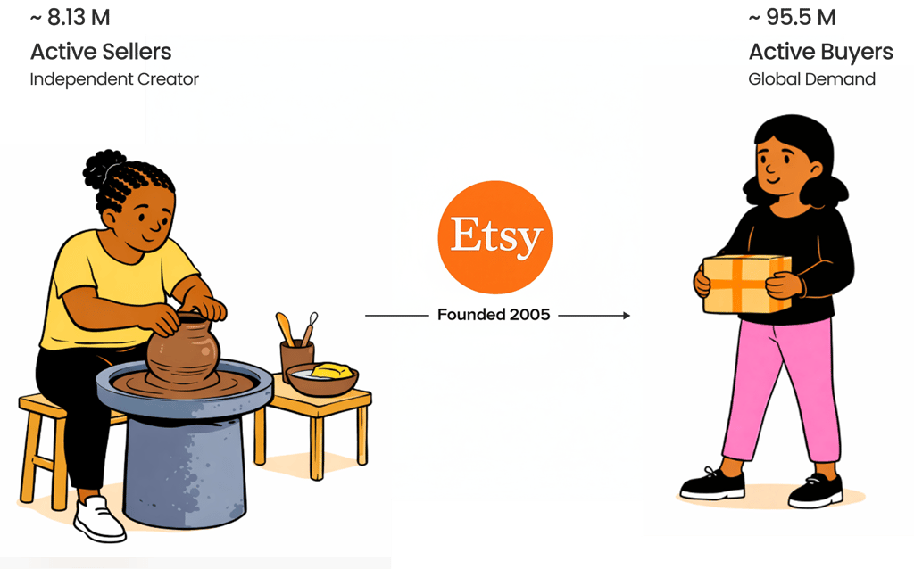
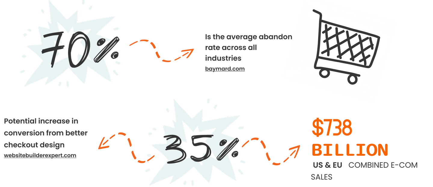
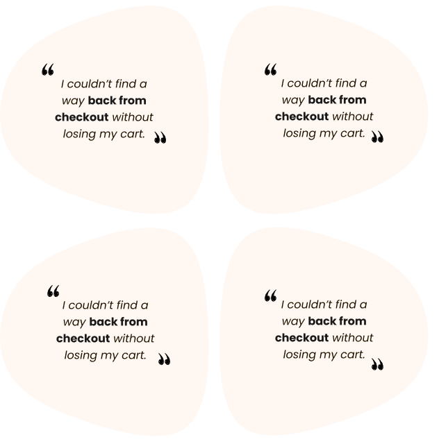
Cart abandonment is a major e-commerce problem, with nearly 70% of carts abandoned across industries.
Our research revealed two patterns of usage among Etsy users
The Gift Giver, who worries about unreliable delivery timelines, and the Budget-Conscious Buyer, who is sensitive to hidden costs and unexpected fees.
This project focused on reducing hesitation at checkout by improving pricing transparency, delivery clarity, and trust signals to support more confident purchasing decisions.
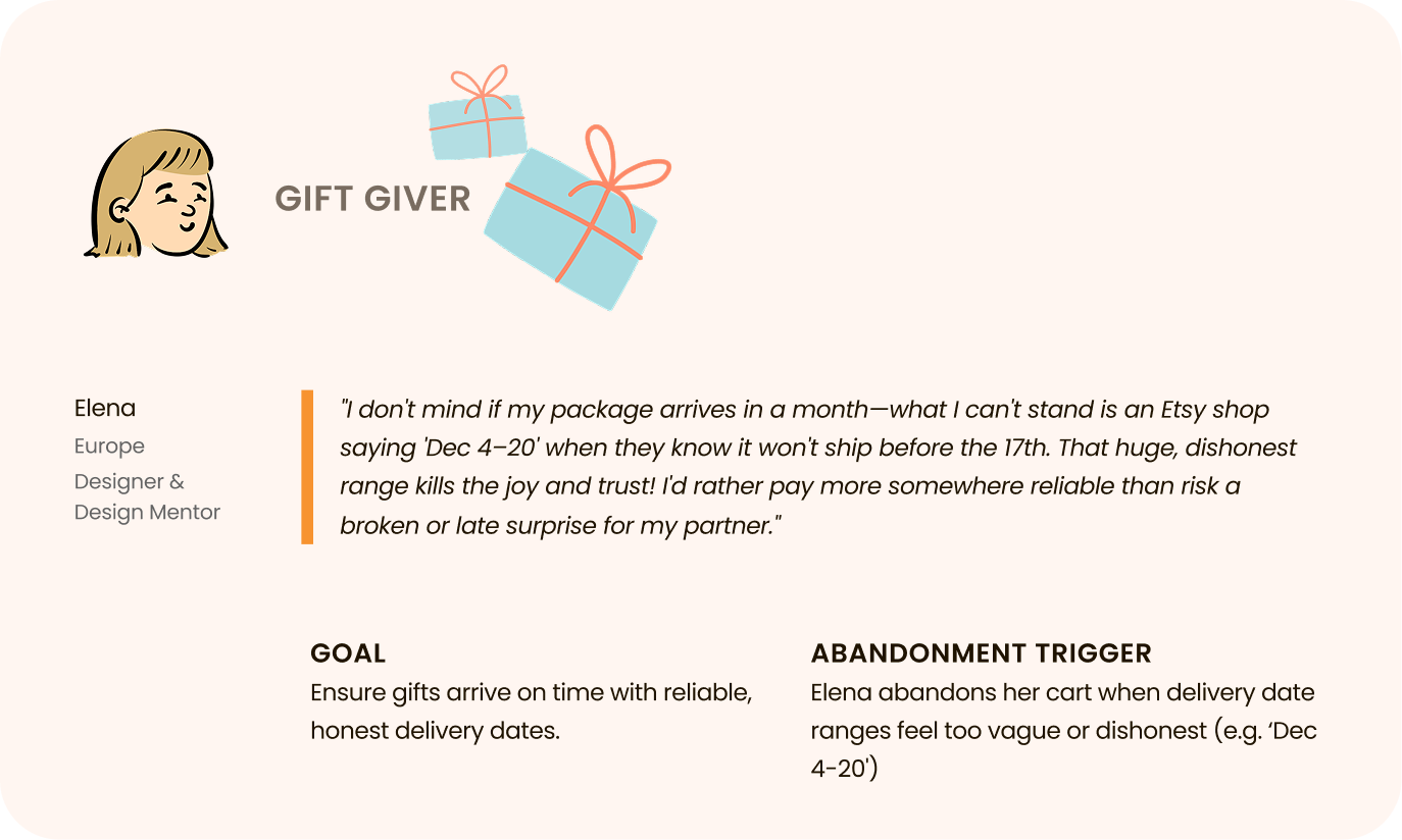
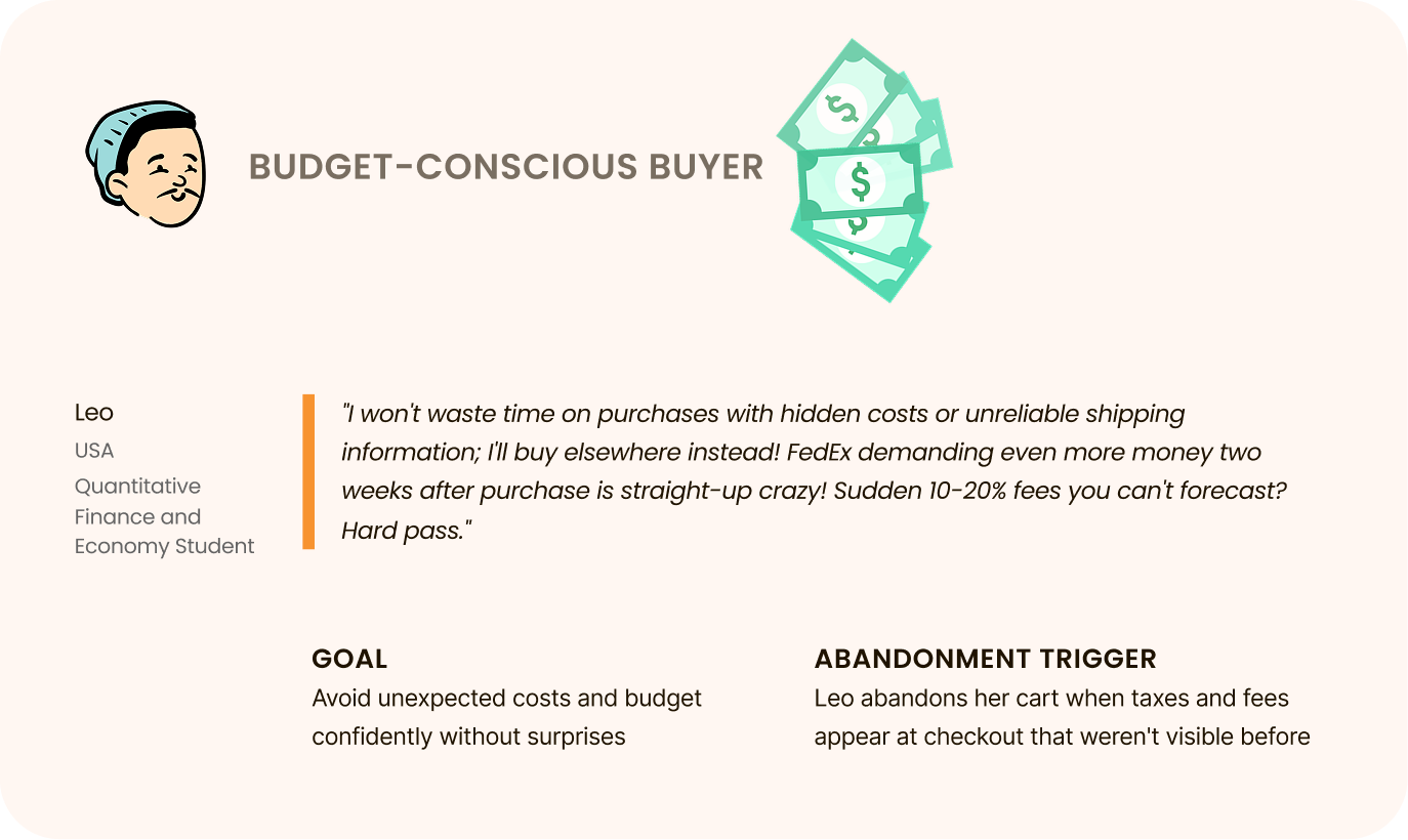
Persona
From Intent to Abandonment: What We Learned from Users
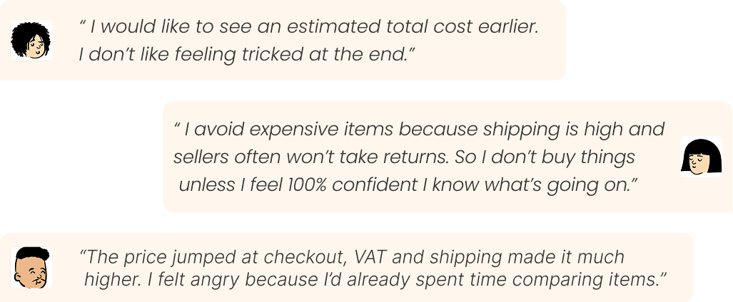
To understand real user frustrations on Etsy, we analyzed feedback from Reddit, Google Reviews, and the App Store. Their stories pointed to repeated friction around transparency, usability, and trust, giving us a clear direction for where the experience was breaking down.
Research
Across interviews and survey responses, a clear pattern emerged: users are not rejecting the product, they’re reacting to uncertainty and late-stage surprises at checkout.
Interview & Questionnaire
17 Questionnaire
6 Interviews
Google Meet
Interview method
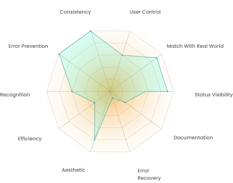
Our Heuristic Evaluation Found That Etsy's Checkout Flow Is Structurally Consistent, But Weaknesses In Visibility, Documentation, Efficiency, And Reassurance Are Creating Friction That Pushes Users Away Before They Complete Their Purchase
Heuristic Evaluation
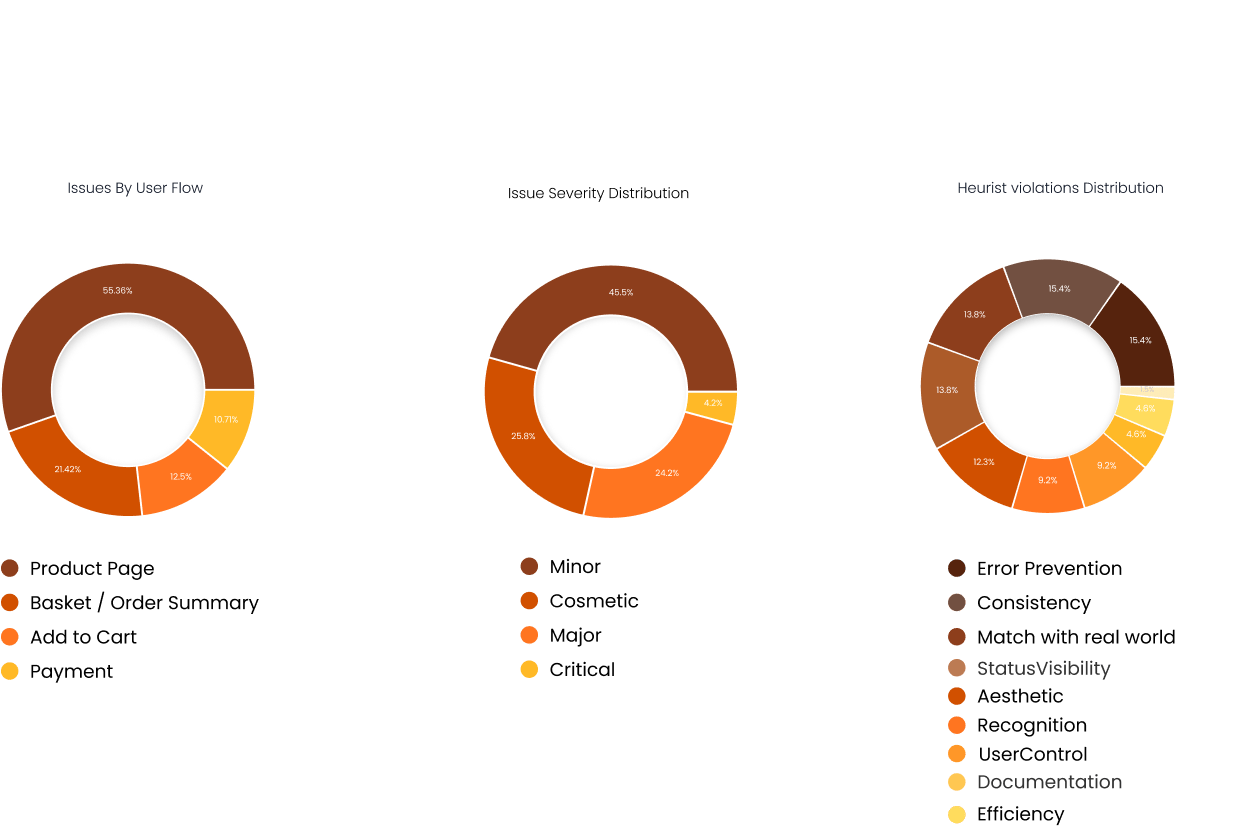
These gaps directly erode trust and decision-making from product page → basket → payment, driving abandonment. Improving them cuts friction and boosts completion rates.
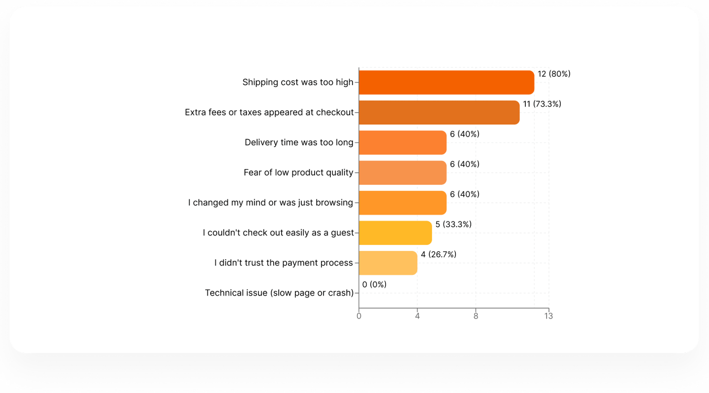
What is preventing users from confidently completing their purchase on Etsy?
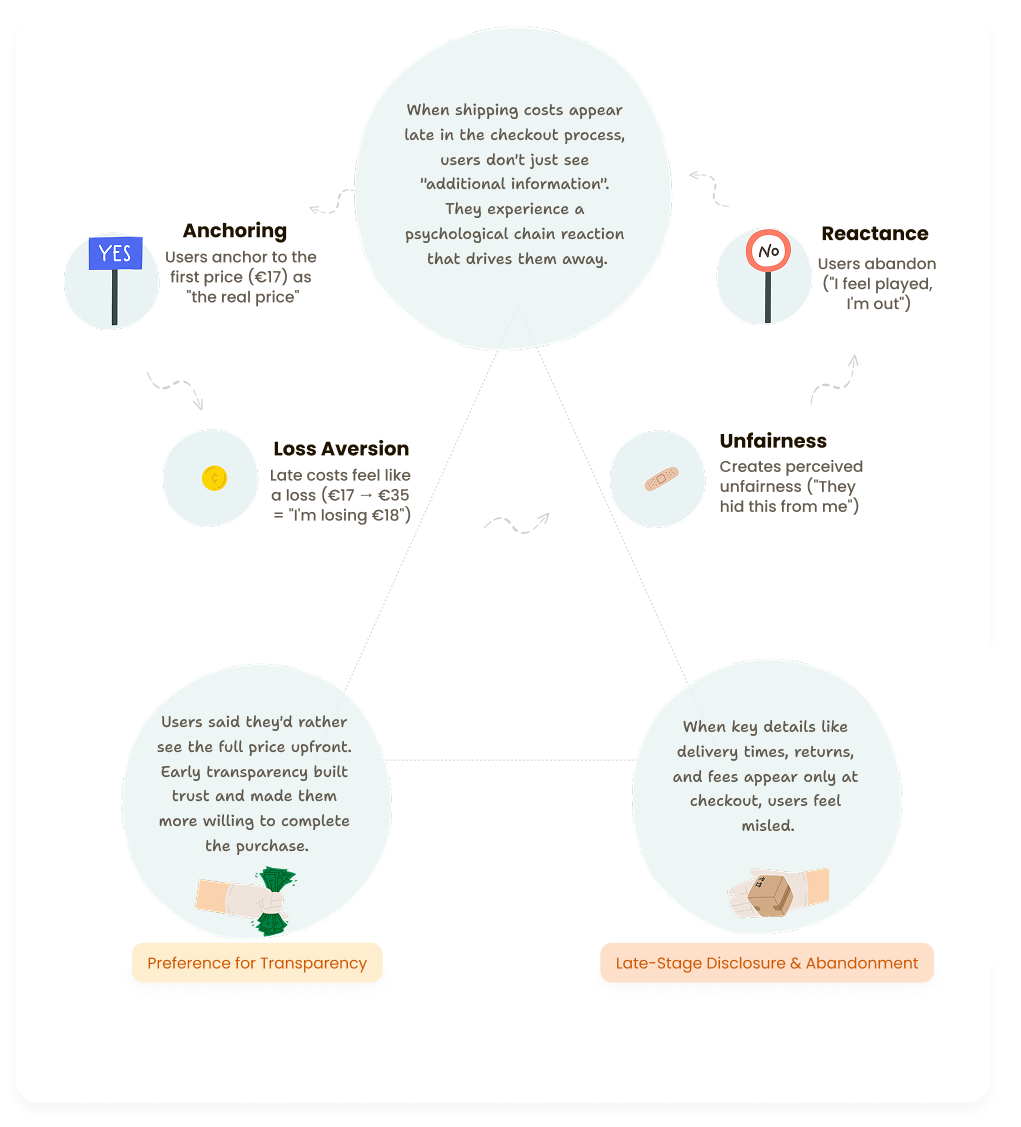
Late price disclosure triggers a psychological cascade of distrust, users prefer honest totals over low teaser prices, and hidden shipping details break confidence entirely.
Transparency Defines the Competitive Standard Across Pricing, Shipping, and Returns
Competitive Analysis


We analyzed Amazon, AliExpress, eBay, and Not On The High Street to understand how leading marketplaces ensure price transparency, shipping clarity, and return visibility from product page to checkout.
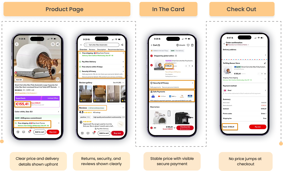
Eatsy
Hides shipping, taxes, and delivery dates until checkout. Return policies are seller-dependent and buried.
Opportunities for Etsy
Hides shipping, taxes, and delivery dates until checkout. Return policies are seller-dependent and buried.
The Impact
Early pricing transparency builds trust and confidence. Hidden costs revealed at checkout create anxiety and drive abandonment.
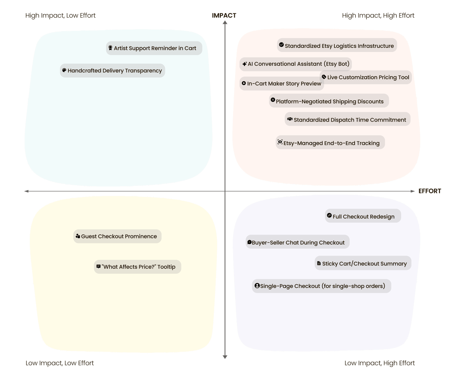
Developing Targeted Solutions to Strengthen Trust, Transparency, and Emotional Connection
Feature Prioritization
By clarifying costs, reframing delivery timelines, and highlighting the human story behind each purchase, we increase buyer confidence and reinforce meaningful support for independent creators.
Increasing Authenticity Before the First Interaction
Our Solutions
Surfacing the Maker: Re-framing the Product Page as a Human Story via Hero Primer + Human Signal design patterns
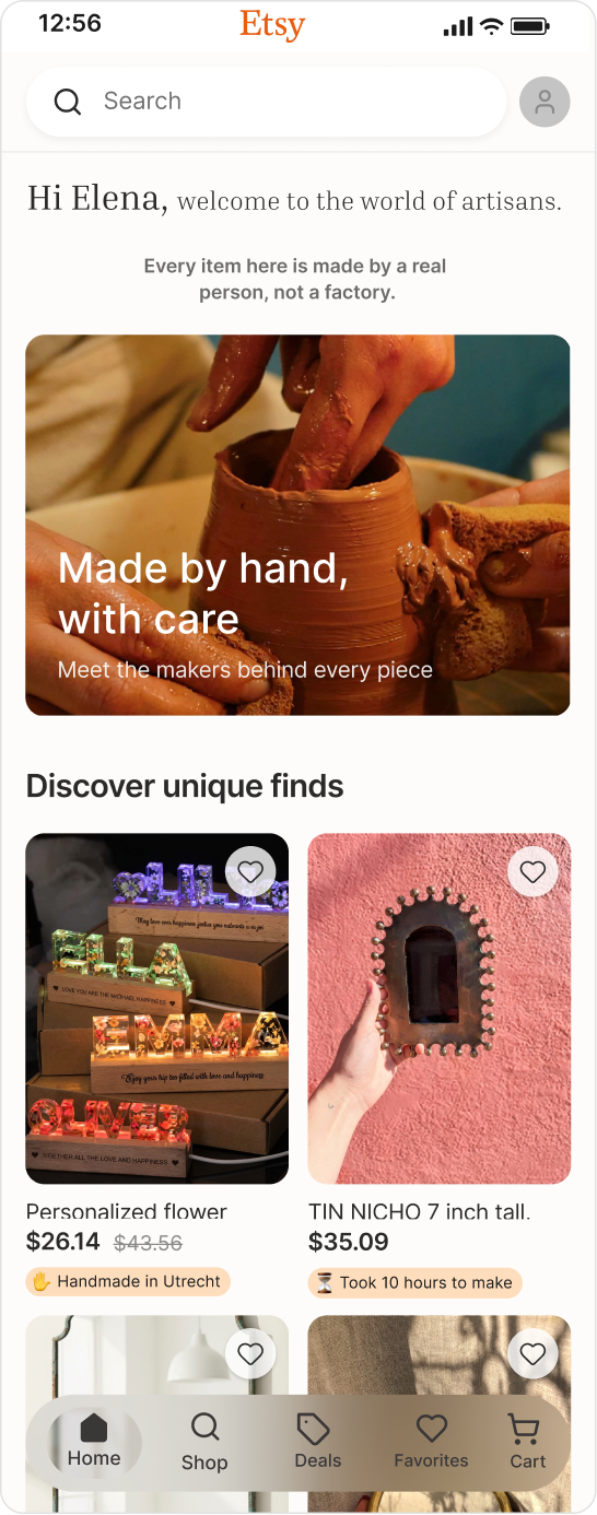
Before redesign: the original homepage showcased products, but not the people behind them. With a few focused, high-impact changes, like introducing a strong hero section and adding human-centered cues, we brought the makers back into the spotlight. The result was a warmer, more meaningful experience that strengthened emotional connection and made Etsy’s human value visible at first glance.
Hero Primer
This message reframes Etsy from a product marketplace
into a human-made creative ecosystem before the user starts searching.

Human Signal
A lightweight human cue added to product cards, designed to be perceived during fast scrolling without slowing users down.
Solution 1

Making Craft and Process Impossible to Miss
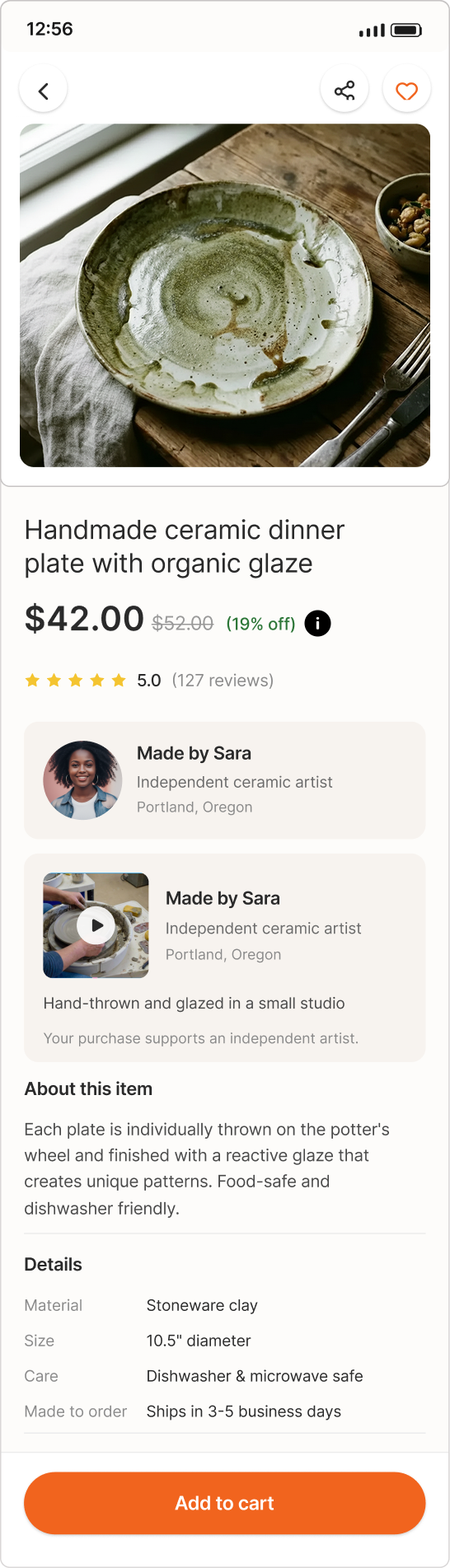
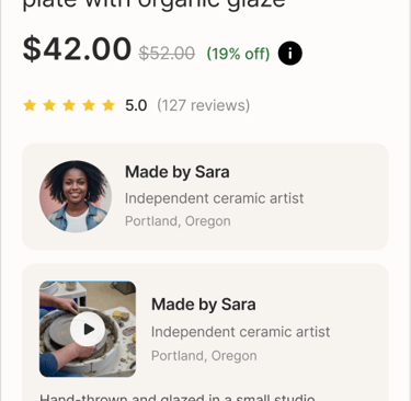
The Final Human Moment: How a Process Video and Artist Reminder Close the Loop on Trust
Before redesign: the previous product page treated items like anonymous listings, no story, no maker, no process. We changed that by bringing the artist and their craft to the surface, revealing not just who made the product, but how it was made. In parallel, we introduced real-time, transparent pricing that updates with customization and delivery choices, replacing last-minute surprises with clarity and trust before checkout.
Handmade Process Showcase
A short seller-created video highlights the crafting process, reminding buyers that each item is handmade by a real artist. It builds authenticity, trust, and emotional connection before checkout.
Solution 2


Make the CTA button sticky
Currently, users need to scroll extensively to reach the CTA.


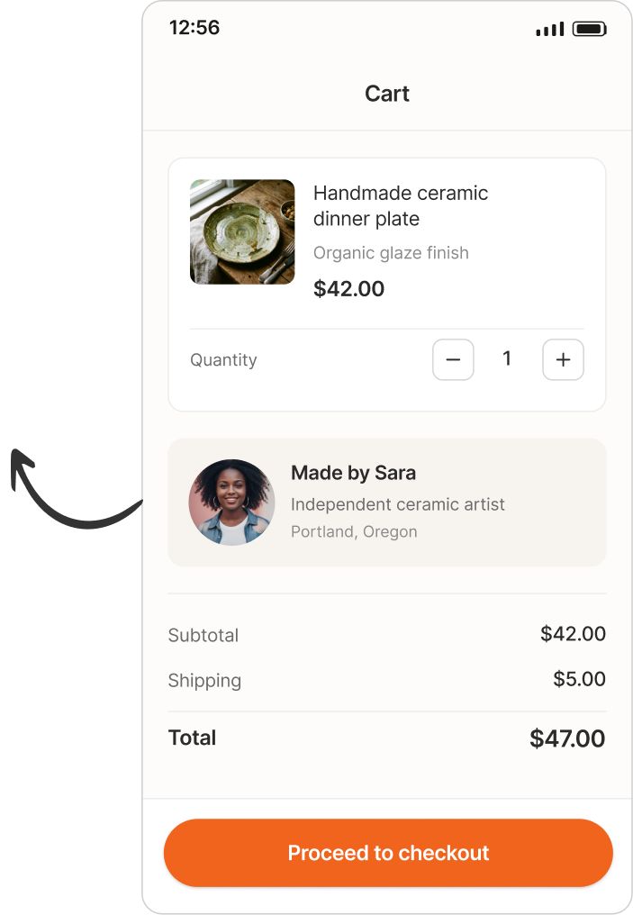
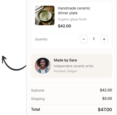
Artist Support Card
A subtle reminder of the person behind the purchase, shown just before checkout.
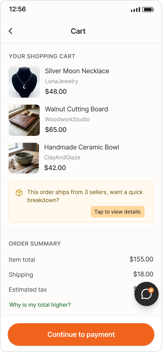
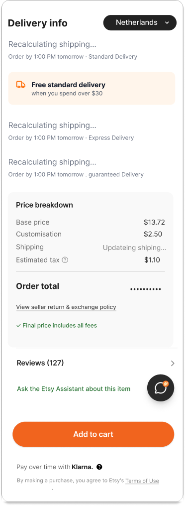
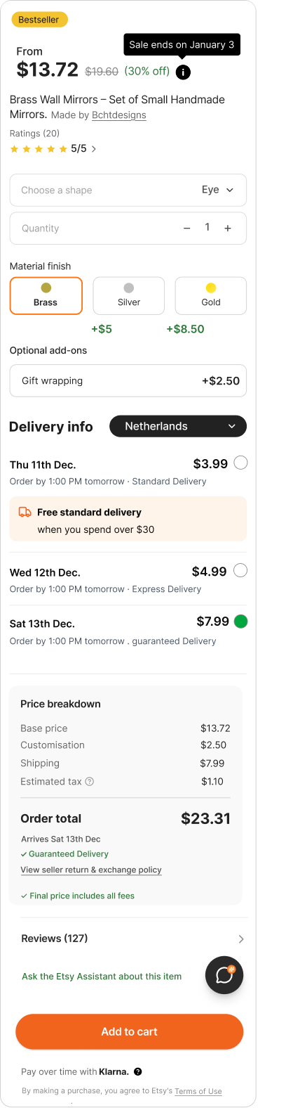
Making Costs Clear from the Start
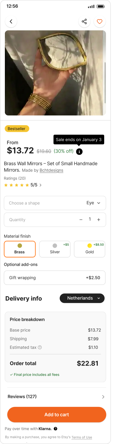
Transparent Pricing from First Impression to Final Confirmation Clear Starting Prices and Live customization That Show the Cost Impact of Every Choice
Before the redesign: pricing lacked clarity across the customization journey. Users were initially shown a base price, but the full cost only became visible after multiple selections were made often late in the process.
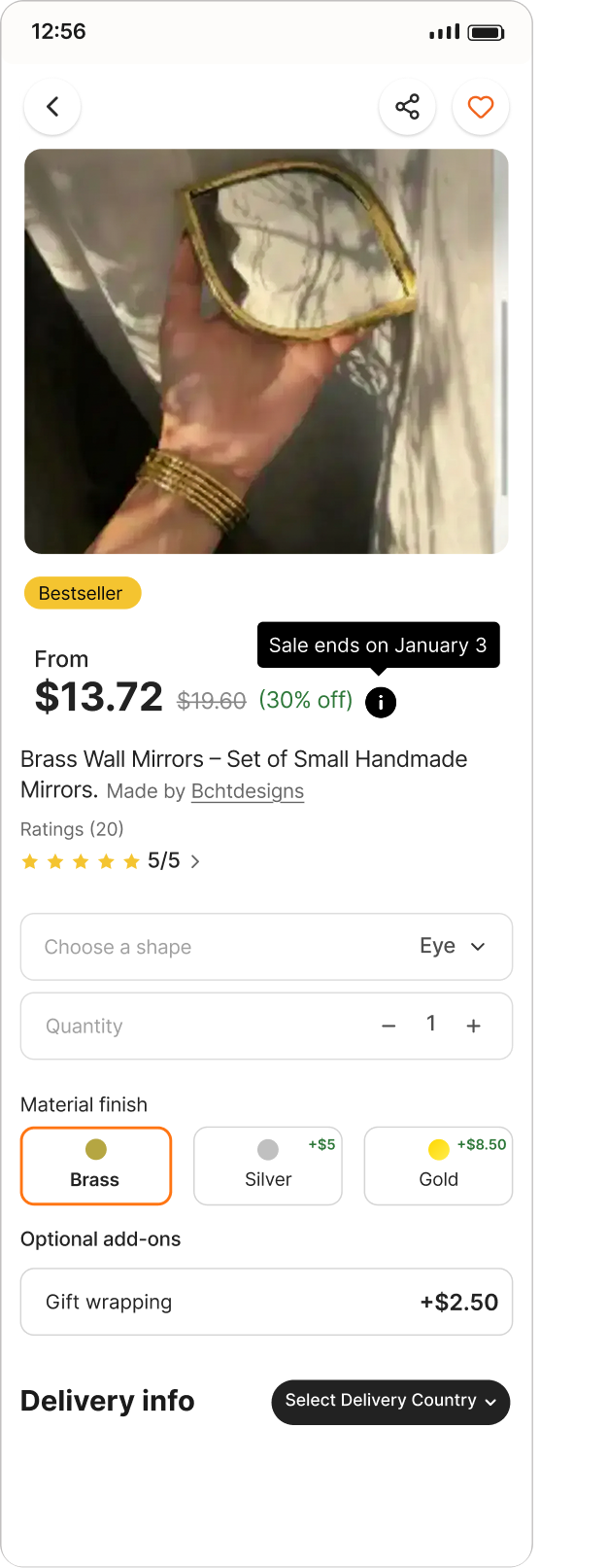
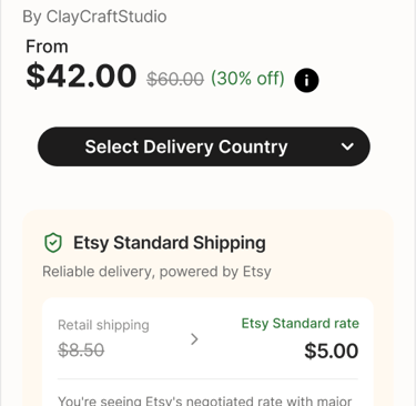
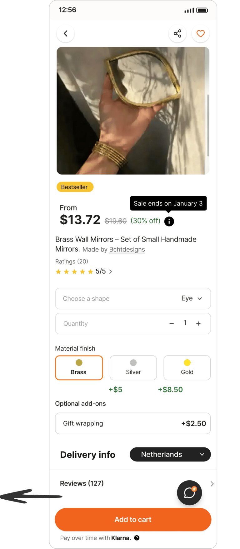
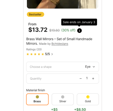
Starting Price Transparency
Shows a “From” price label for variant-based products, with a tooltip clarifying that the final price depends on selected options.
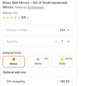
Live Customization with Transparent Pricing
Customize item in real time
See price and delivery updates instantly
Know the final cost before placing your order
Solution 3
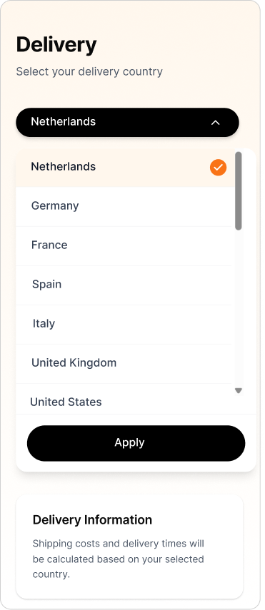
Giving Buyers Full Control
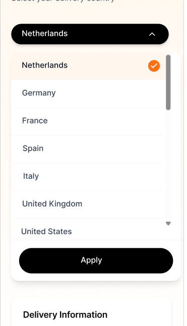
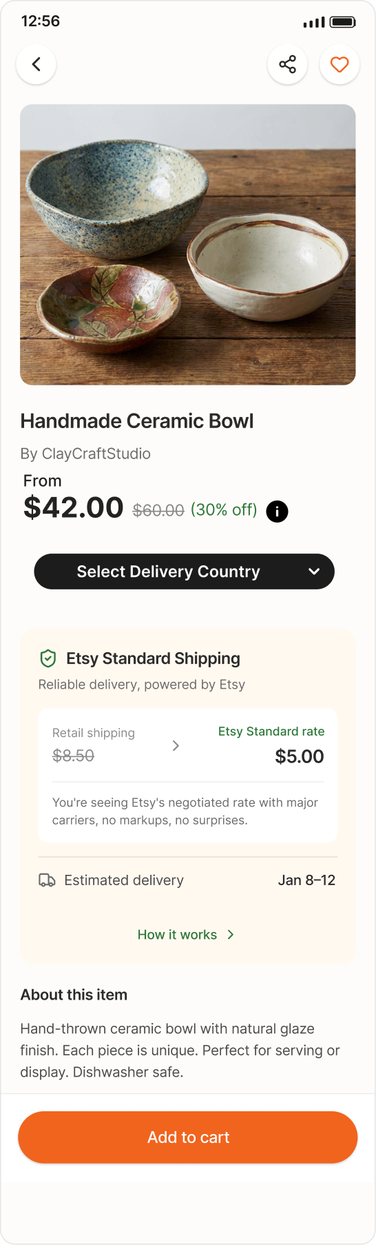
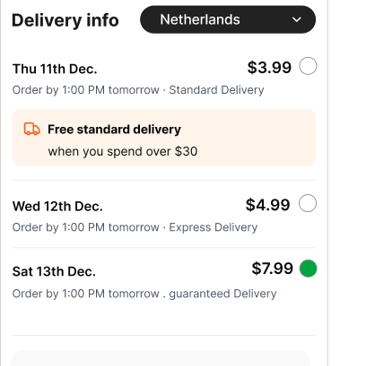
Live Country Selection That Instantly Updates Prices, Reveals the Final Cost Upfront, and Lets Buyers Choose the Delivery Speed That Works for Them.
So Full Pricing Transparency Increases Trust, Reinforces Reliability, and Turns Hesitation Into a Completed Purchase
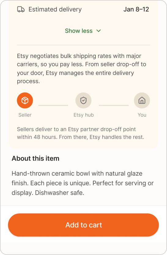
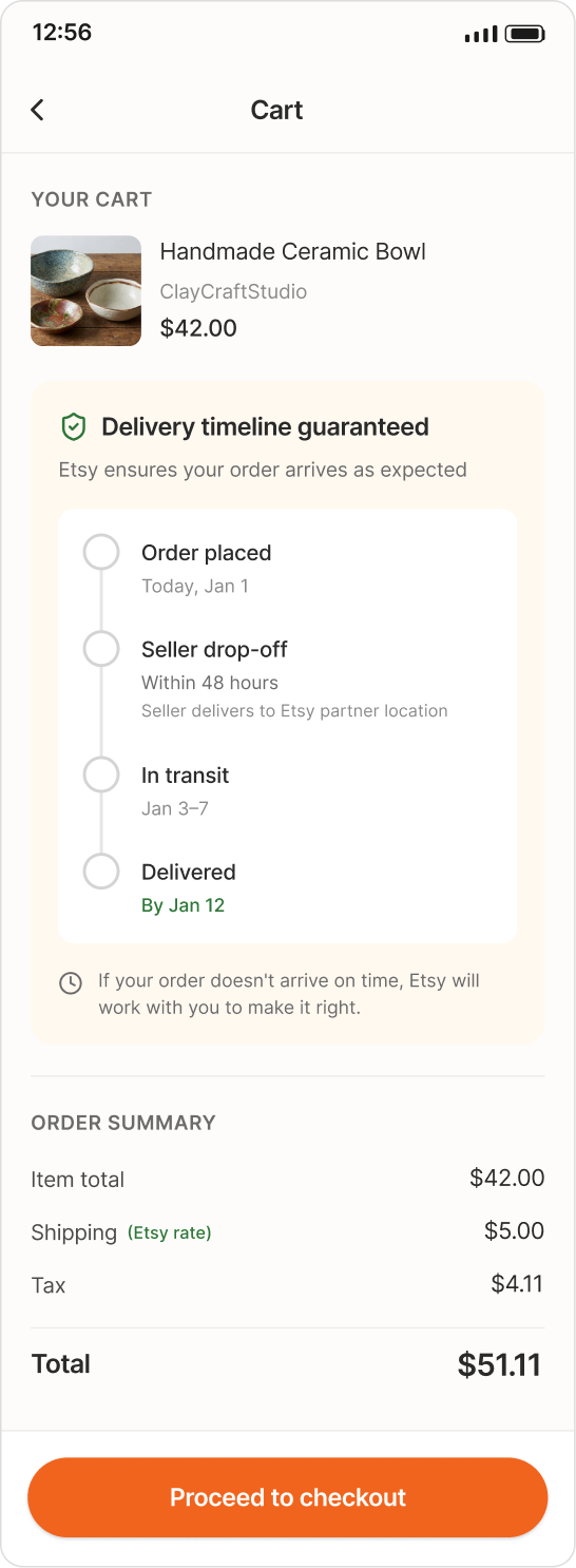
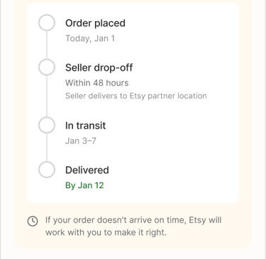
Before the Redesign: Etsy showed delivery estimates as broad windows like "Arrives in 5–21 business days" with no distinction between seller processing time and actual transit time. Urgent buyers had no guaranteed option, and delivery progress disappeared completely once the order was placed.
Solution 4


Real-time delivery
Etsy Standard Logistics Infrastructure: Real-time delivery visibility improves clarity, but we saw a bigger opportunity. Our proposal is that Etsy builds its own logistics infrastructure , standardized drop-off windows, bulk carrier discounts, and centralized tracking
Solution 5

Etsy Standard Logistics Infrastructure
Discounted Rates (Pricing Transparency).
Etsy secures massive shipping discounts from carriers (like FedEx/UPS) due to bulk volume.
Guaranteed Timelines (Delivery Certainty).
Sellers commit to delivering the item to an Etsy-partnered drop-off point within a standardized window (e.g., 24-48 hours)
Centralized End-to-End Tracking (Trust).
The entire tracking system is standardized and managed by Etsy.


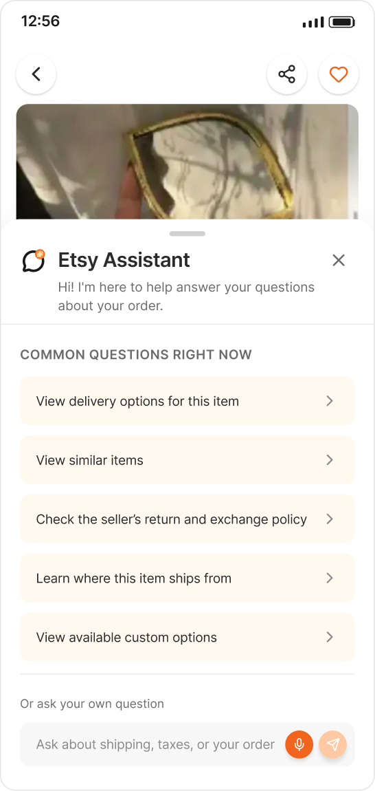
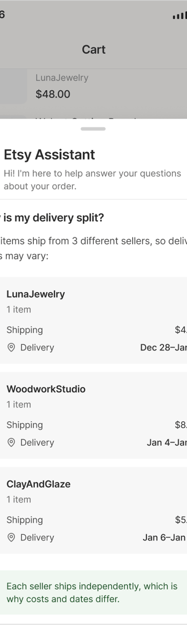
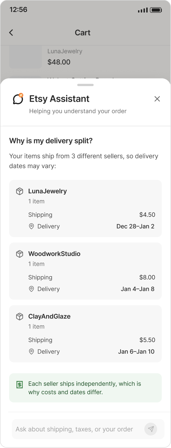
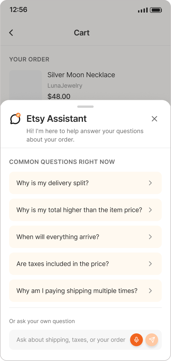
No Question Left Behind
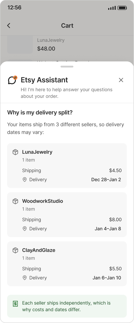
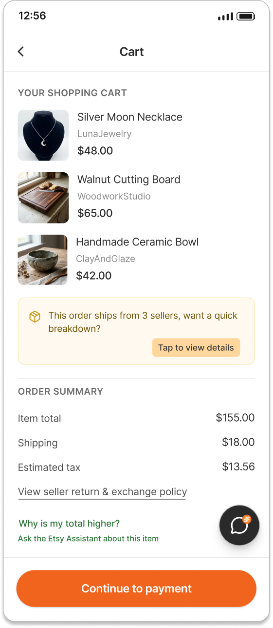
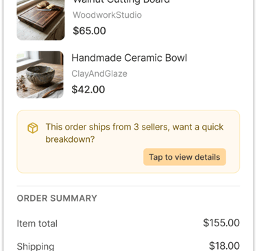
When buyers can't find a quick answer, they leave. Etsy Assistant stays with them from the product page all the way to the cart, providing instant clarity on shipping, taxes, delivery, and fees so hesitation never becomes abandonment.
Solution 6
Before the redesign, Etsy had no support presence on the product page or in the cart. When buyers had questions about shipping, taxes, or fees, their only options were to search through seller FAQs, leave the page to contact the seller directly, or simply make assumptions. For most buyers, this uncertainty was enough to stop the purchase entirely.
Etsy Bot / Assistant
A contextual assistant that reduces uncertainty by answering questions instantly during product selection and checkout.


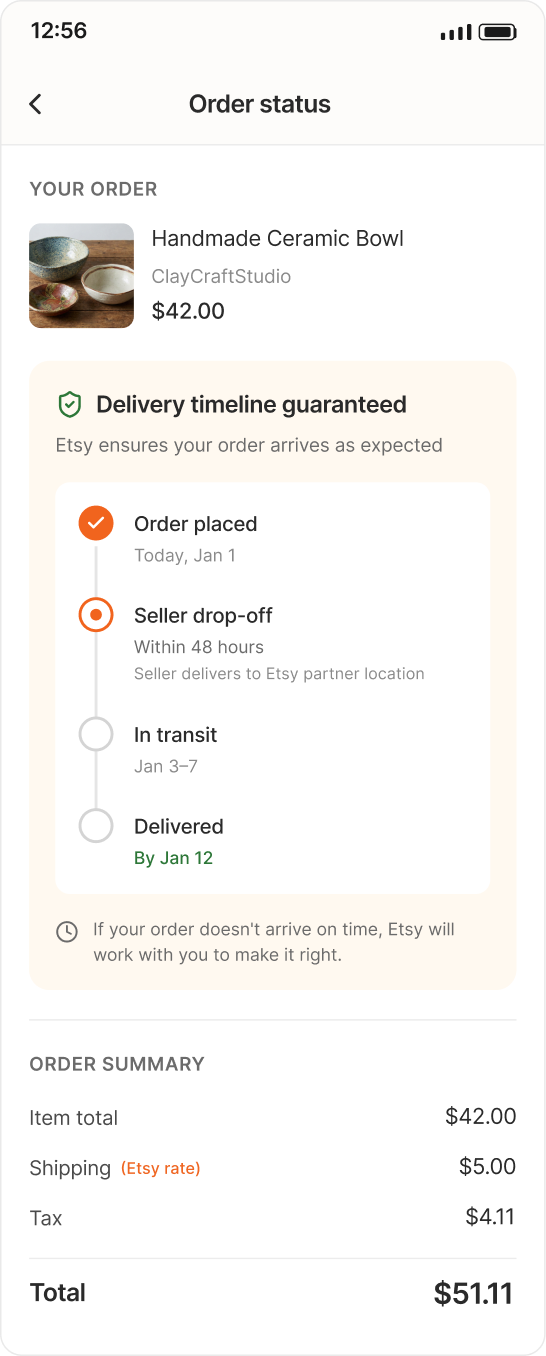
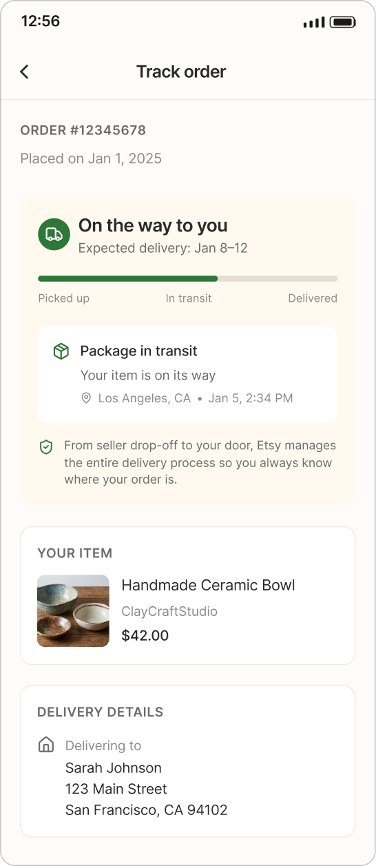
Reducing Post-Purchase Uncertainty Through Direct Tracking Access, Clear Order Status Visibility, and Delivery Time Assurance
Solution 7
Before the redesign, Etsy did not provide a dedicated post-purchase tracking structure. After completing a purchase, users were not guided to a centralized tracking page with clear delivery confirmation or real-time status visibility.
Usability Testing with 6 Participants: Clear Design Improves Trust and Reduces Uncertainty
Usability Tests
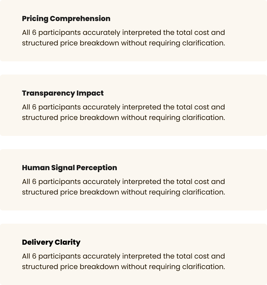
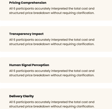
Usability tests informed these key improvements
Applynig The Fixes
Etsy Bot / Assistant
A contextual assistant that reduces uncertainty by answering questions instantly during product selection and checkout.


Product Page
Etsy Bot / Assistant
A contextual assistant that reduces uncertainty by answering questions instantly during product selection and checkout.


Etsy Bot / Assistant
A contextual assistant that reduces uncertainty by answering questions instantly during product selection and checkout.


Product Page
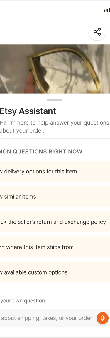
Making Assistance Impossible to Miss
“I almost didn’t notice the AI Assistant, it would help to have a small hint or question in the screen to make it more visible.”


Key Takeaways: Lessons Learned
This project ended up being much more than an exercise in reducing cart abandonment. It taught me that most users don’t leave because they suddenly stop wanting the product, they leave because they stop feeling confident about their decision.
In this case, that hesitation was often driven by uncertainty: hidden costs, doubts about the seller, or a lack of reassurance at the exact moment of purchase. Working on price transparency and trust signals reinforced something I deeply believe in: good UX is not just about making flows shorter, it’s about reducing user anxiety at decision points.
Small things turned out to matter a lot. A clearly explained price, a well-placed trust cue, or a short piece of reassurance copy often had more impact than bigger UI changes. This project reminded me to look at the experience not only through usability metrics, but through the user’s emotional state, where they hesitate, where they second-guess themselves, and where they need clarity instead of persuasion.
My role as a designer here wasn’t to push users forward, but to make their decision feel safer, clearer, and more human.