
Improving Financial Decision-Making on Revolut with Personalized Insights, Accessible Financial Tools, and Proactive Guidance
Timeline
6 Weeks
Mentor
Marzieh Nadali
Role
UX Researcher
UX Designer
Team
3 Designers
Introduction to Revolut
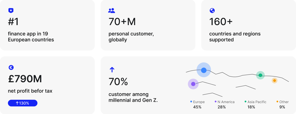
Revolut is one of Europe’s largest digital banks. Founded in 2015, it combines everyday banking, payments, savings, investments, and travel services in one mobile app. Today, it serves millions of users across 40+ countries as a go-to financial super app.
Make money easy to control
One app to manage all things money
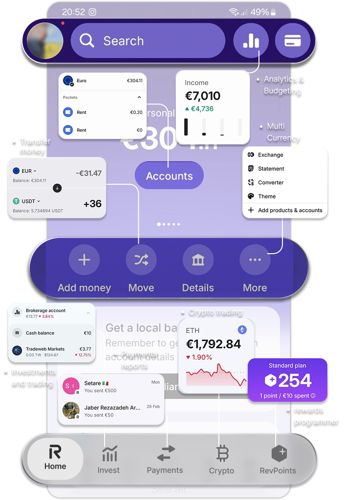
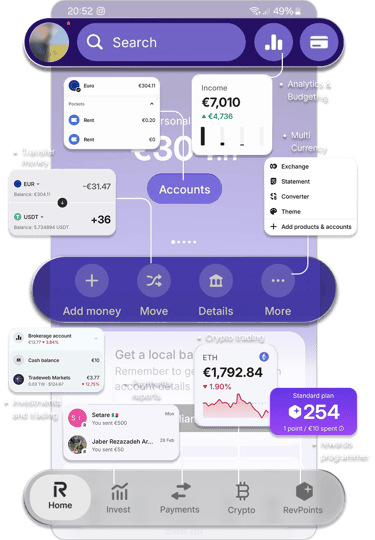
Started with affordable international transfers and fee-free cards abroad. It grew fast, adding savings vaults, crypto trading, investments, and smart analytics.
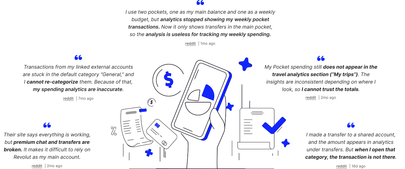
We reviewed online discussions and App Store feedback to understand where users feel friction.

Desk Research
Incomplete or Resetting Data reduces User Confidence
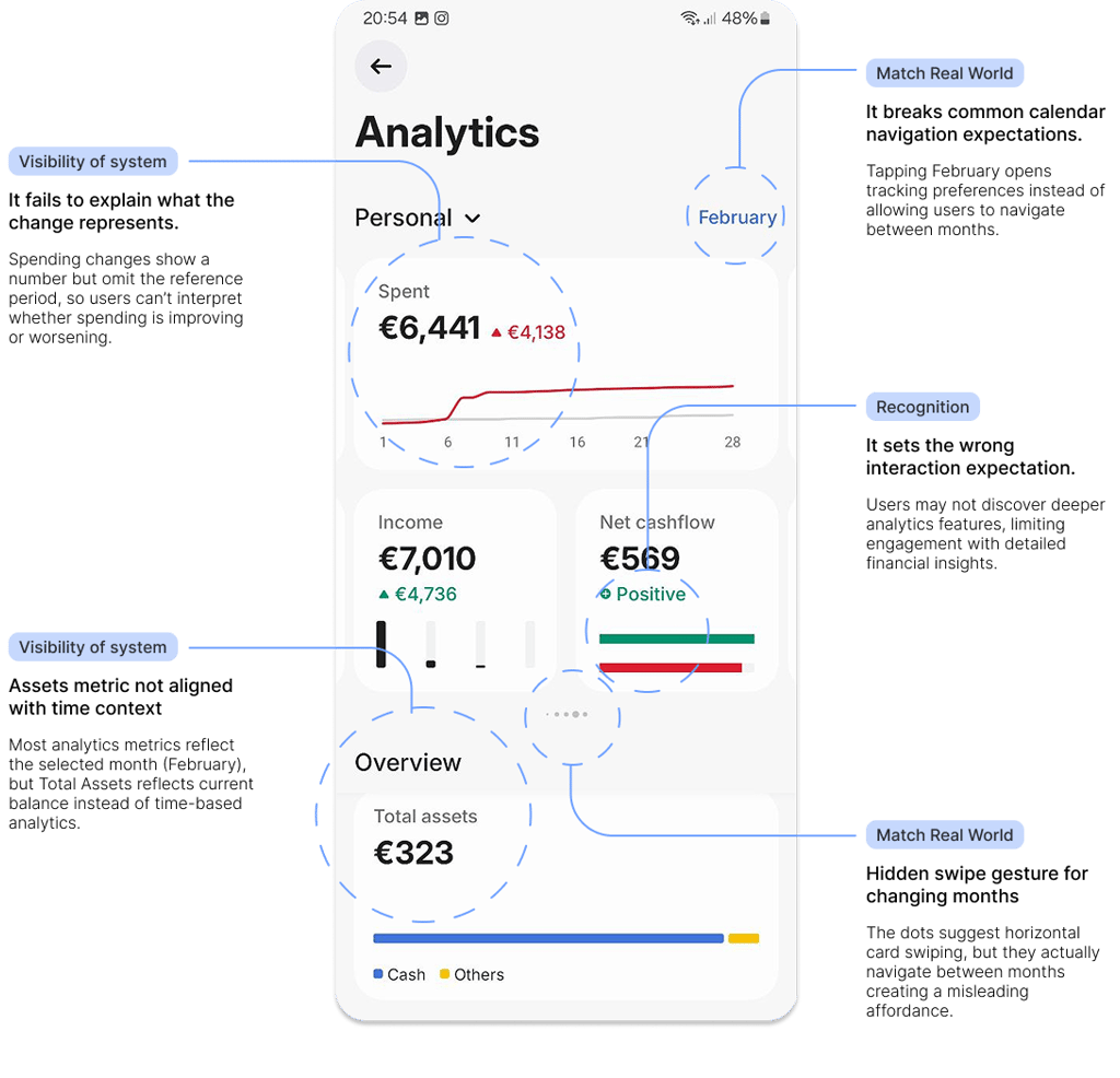
Discoverability issues and unclear interaction patterns prevent users from exploring deeper analytics, while the absence of contextual explanations forces users to interpret financial data on their own.
Heuristic Evaluation
A data visibility problem rather than a data availability problem
Interview
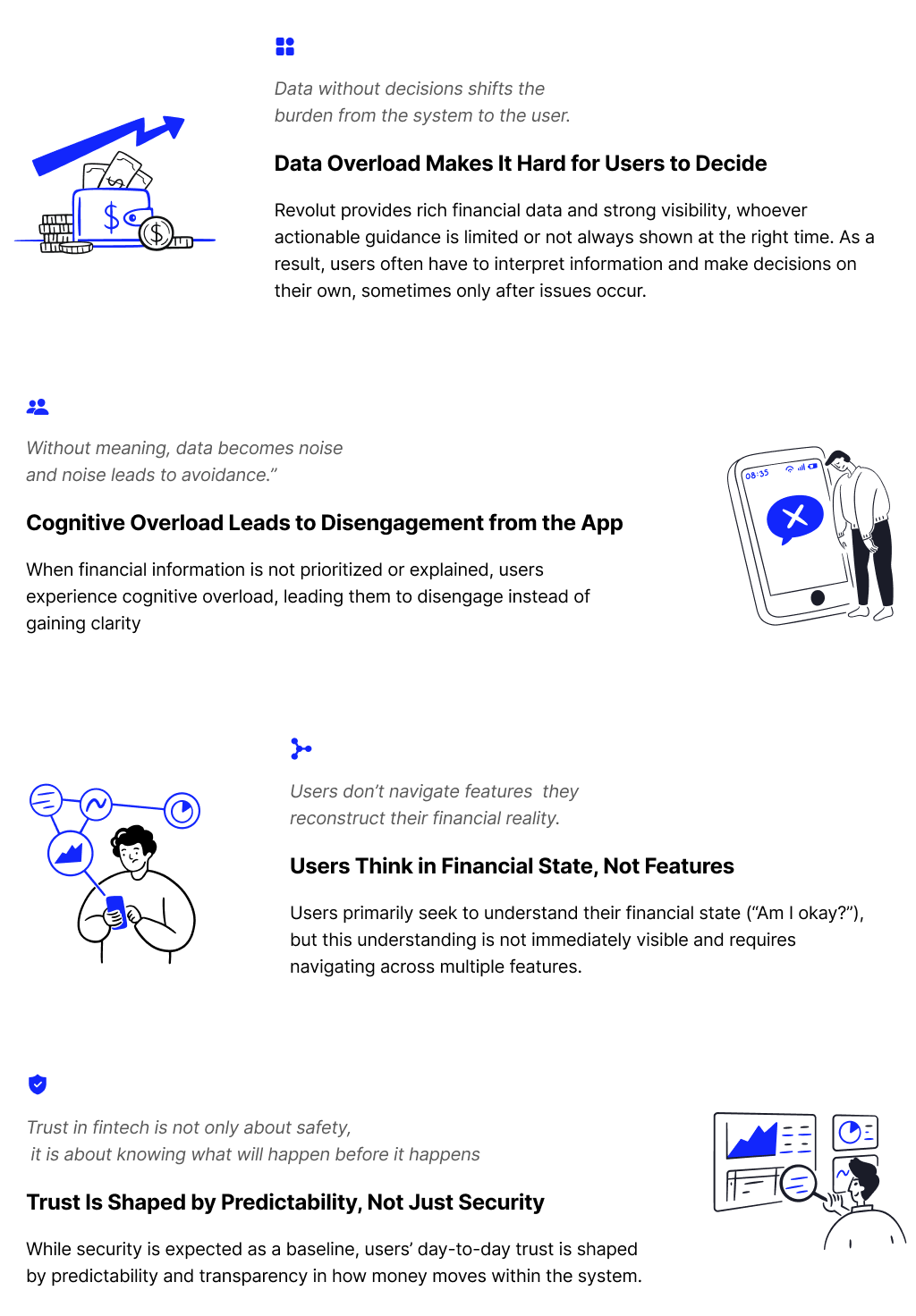
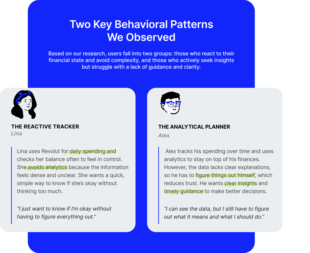
Most users don't know how to act on the provided data by Revolut
Through 9 user interviews, we explored how users understand their financial situation, track spending, and make decisions using Revolut. The research revealed recurring challenges not in accessing data, but in interpreting it.
9 user interviews | ~30 minutes each
Competitive Analysis
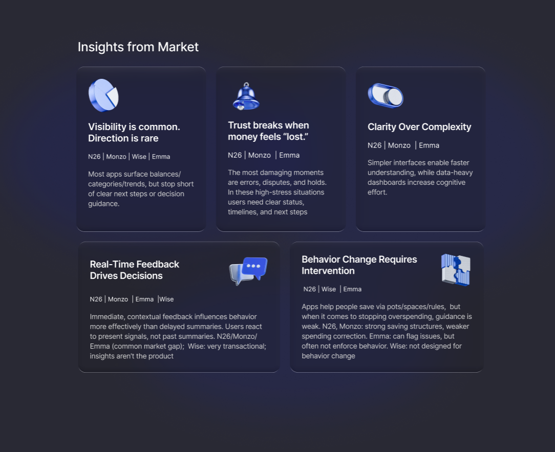
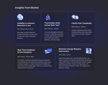
Automation is rising; real guidance is rare
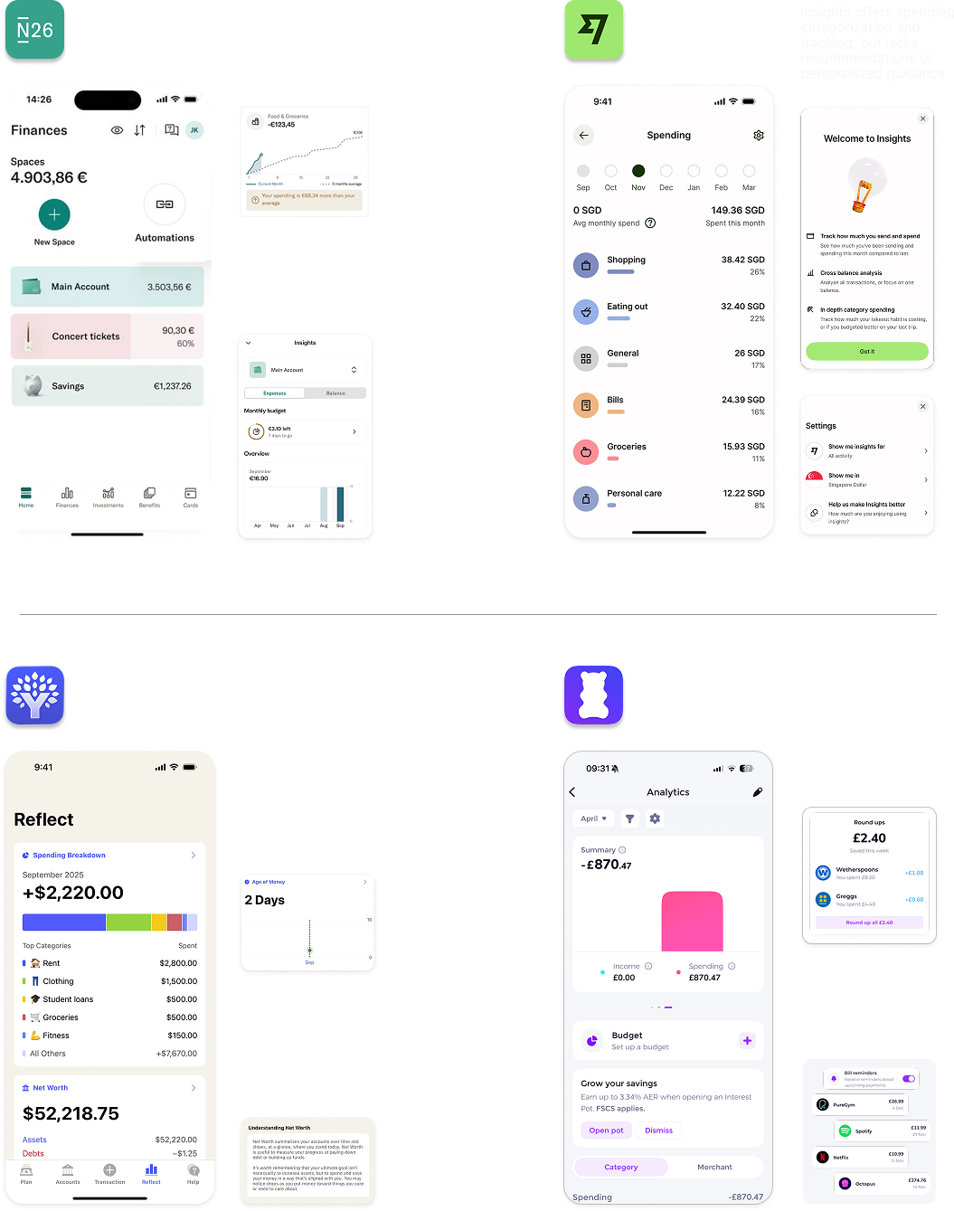

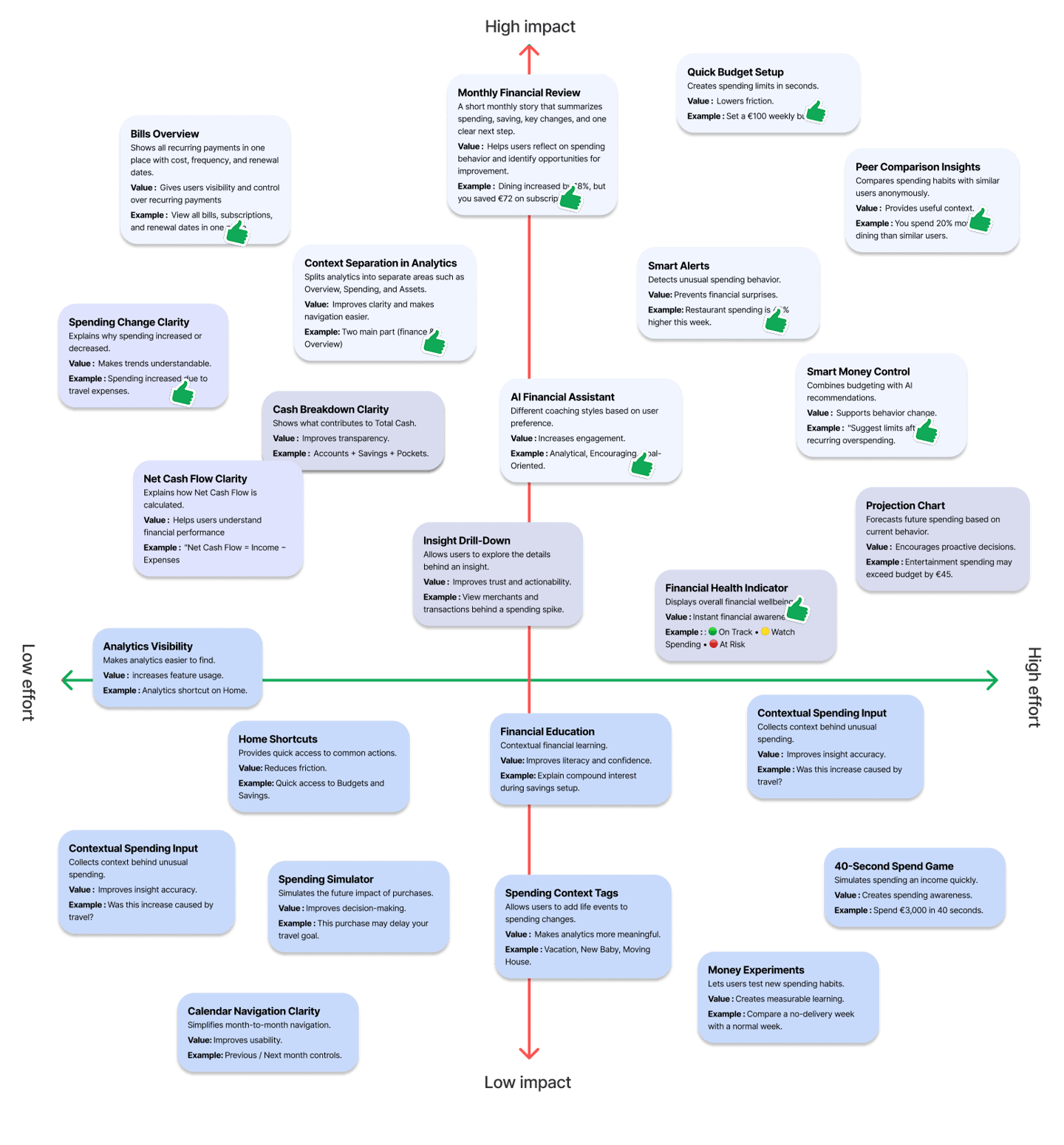
Prioritize concepts through an Impact–Effort Matrix, focusing on ideas with the highest potential user and business value.
Ideation
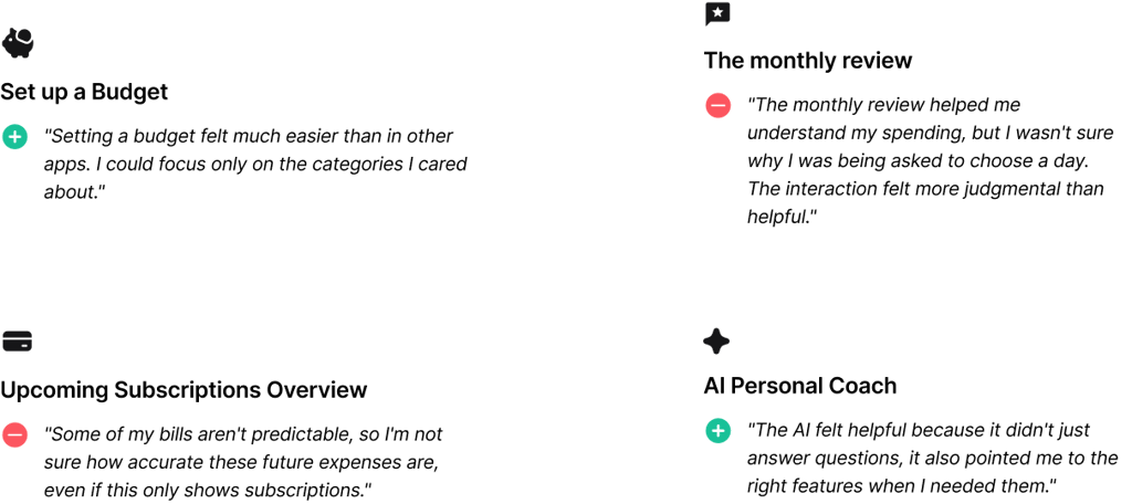
AI Personal Assistant
UI Design
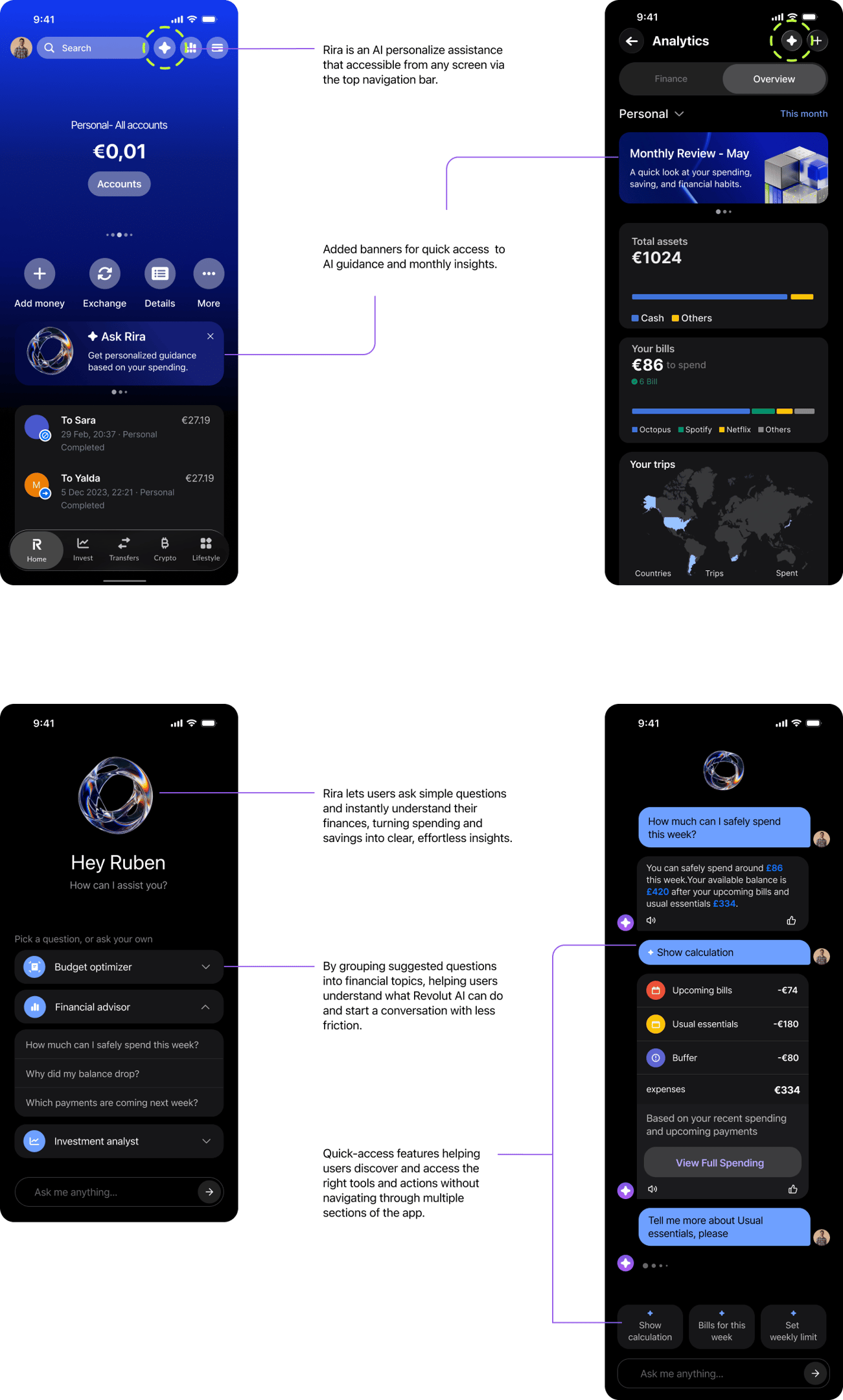
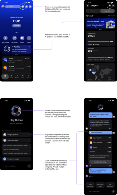
Design Solution (proposed Design)
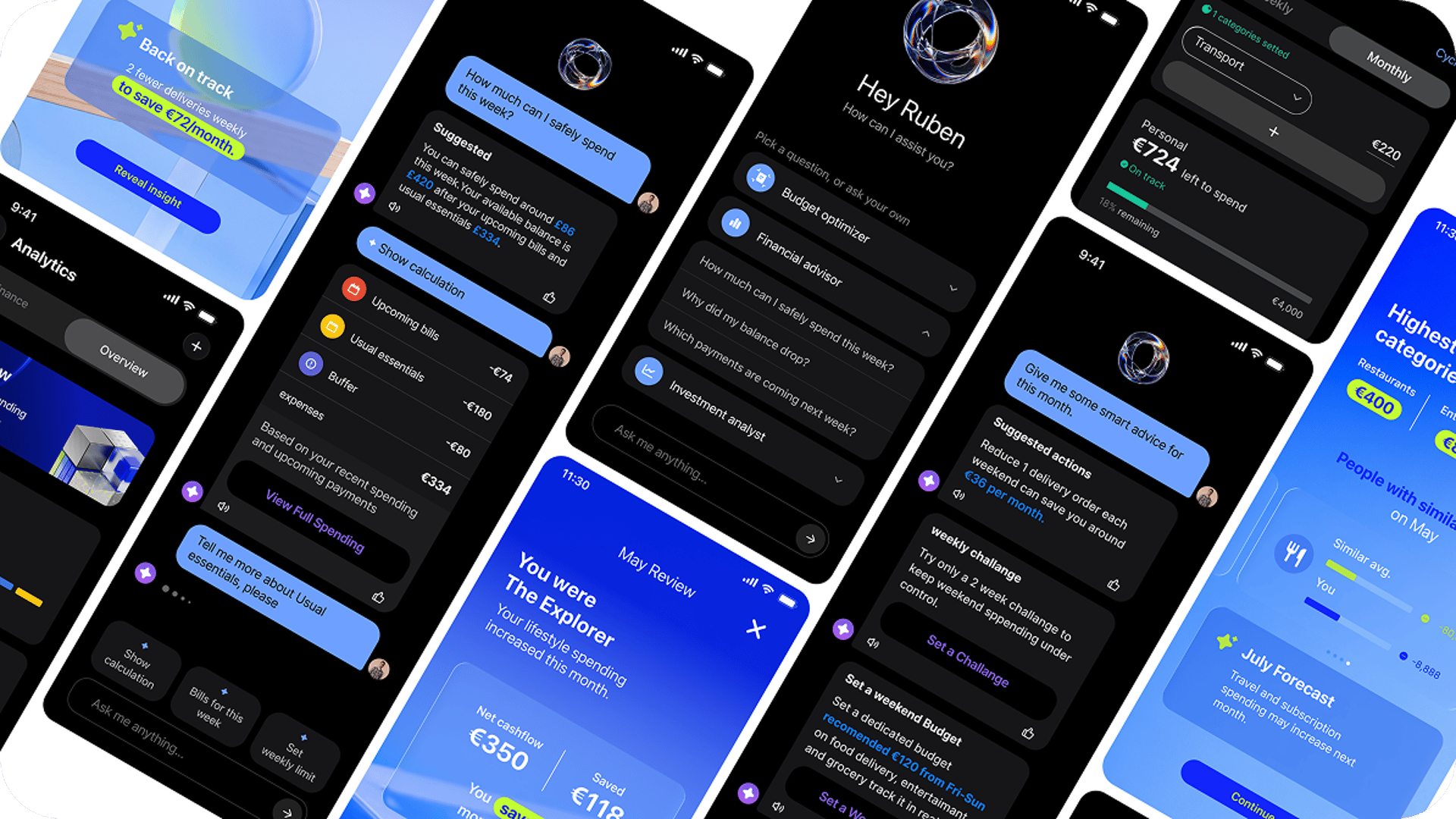
Users lacked guidance on what actions to take after reviewing their financial data. I introduced an AI assistant that helps users interpret insights, discover relevant tools, and take action with confidence.
The following concepts were designed to address the key research findings.
Context Separation in Analytics
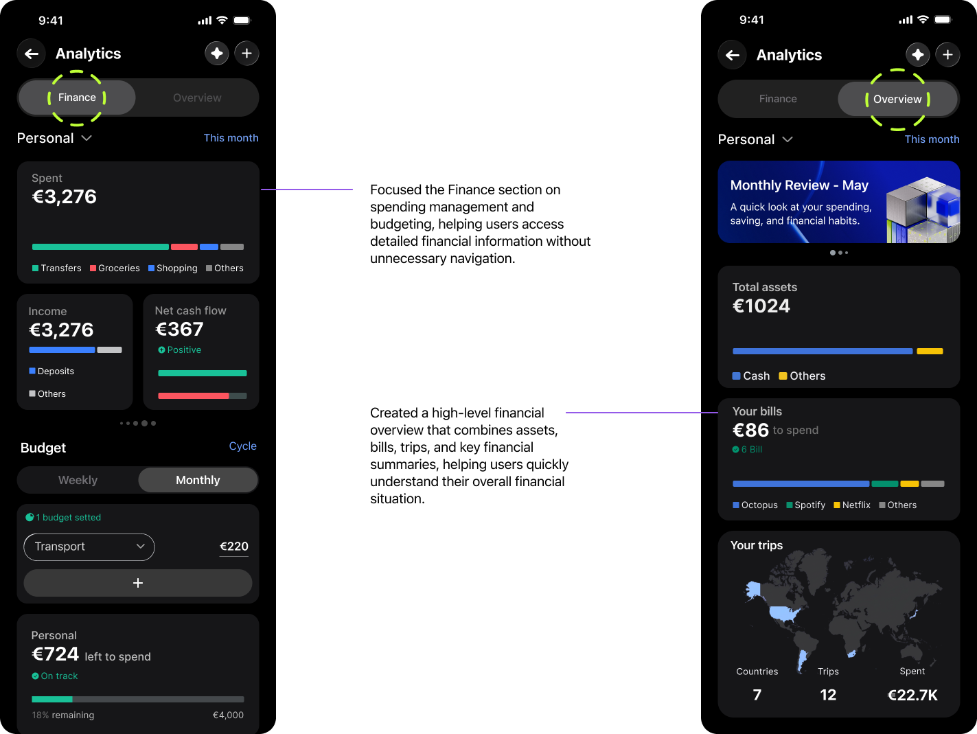
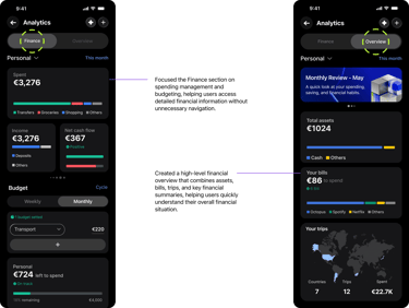
Reorganized Analytics into Finance and Overview sections, reducing cognitive load while creating dedicated spaces for spending management, financial summaries, bills, and personalized insights.
Upcoming Subscriptions Overview
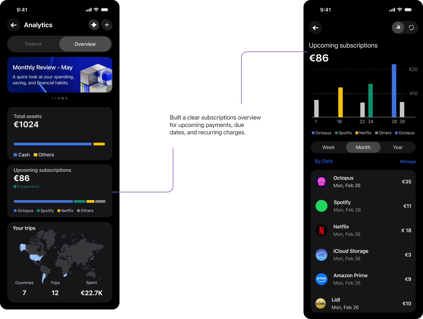
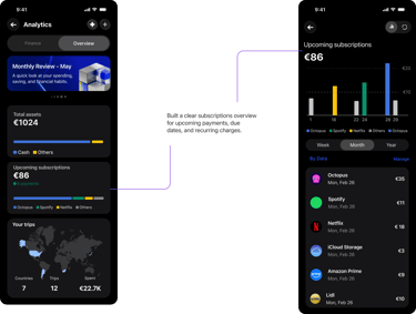
Users had limited visibility into future expenses and recurring payments. I created a centralized subscriptions overview to help users anticipate upcoming costs and avoid financial surprises.
Set up a Budget
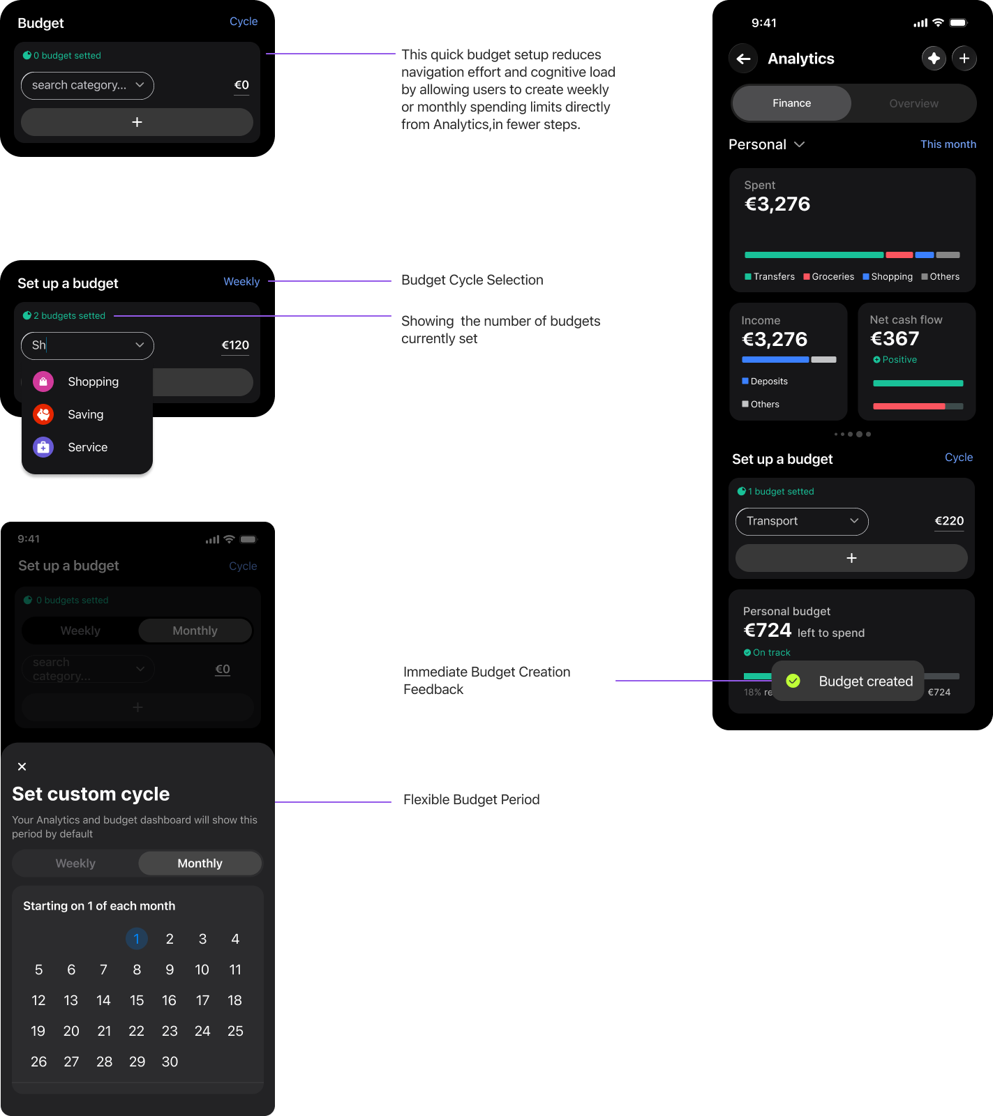
Budgeting was difficult to discover and required multiple steps. I simplified budget creation and integrated it directly into Analytics to make financial planning easier and more accessible.
Set up a Budget
Budgeting was difficult to discover and required multiple steps. I simplified budget creation and integrated it directly into Analytics to make financial planning easier and more accessible.
Monthly Review
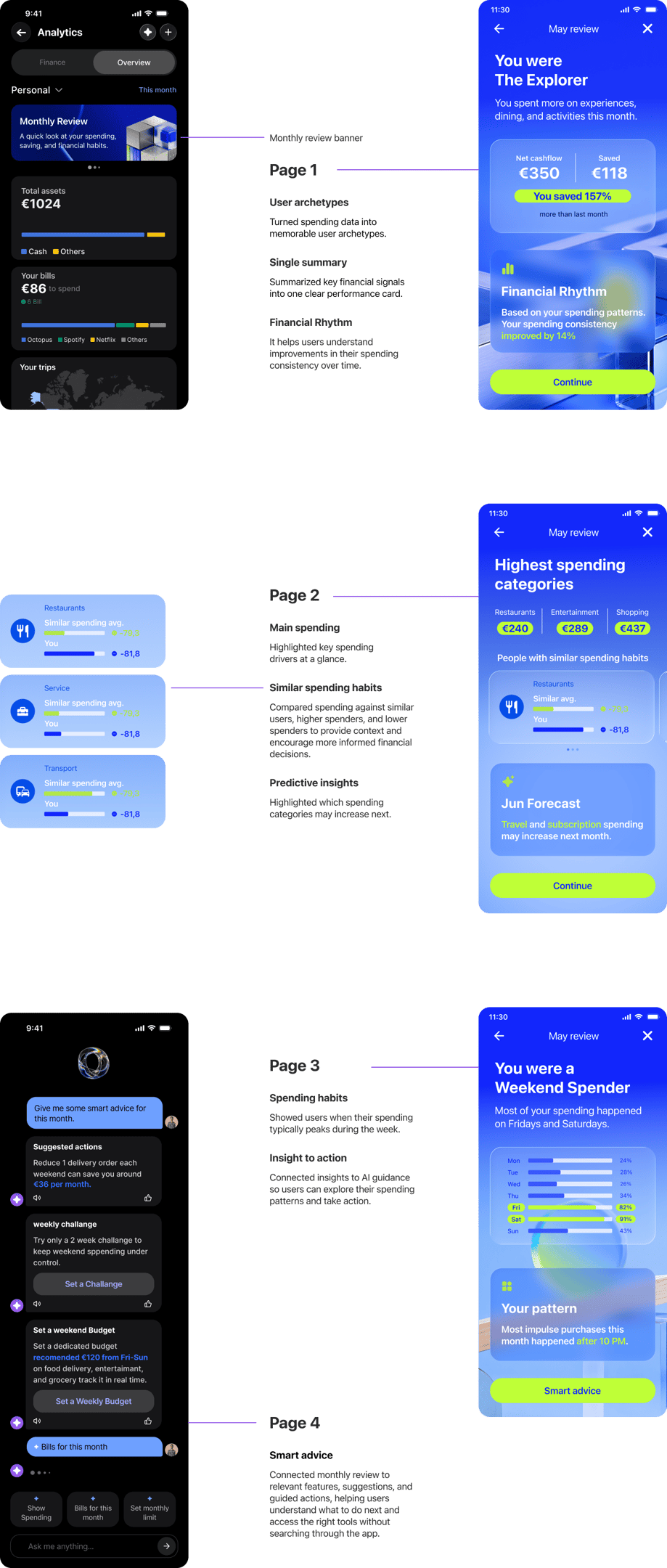
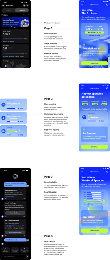
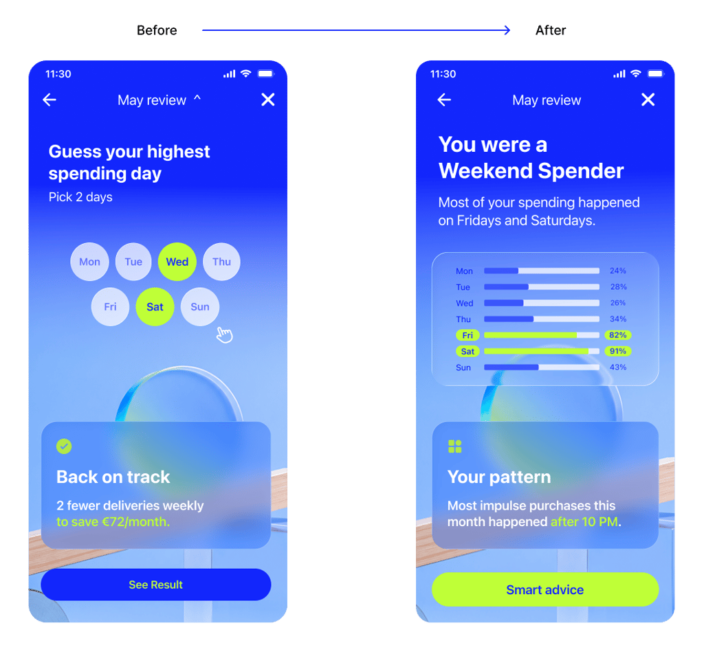
Users struggled to understand their overall financial situation from fragmented analytics. I transformed monthly data into a simple, personalized financial story that highlights key behaviors, progress, and opportunities.
Spending Insights & Money Advice
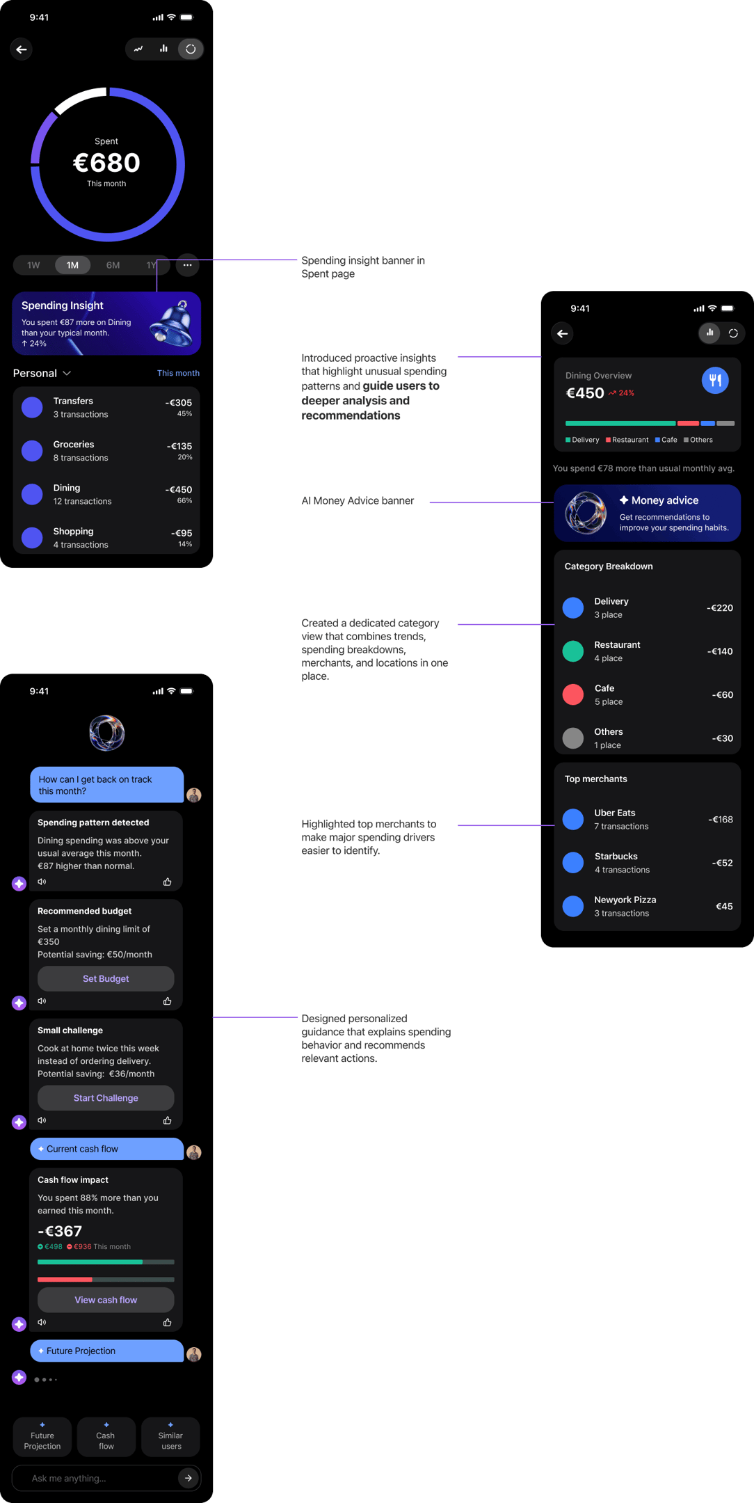
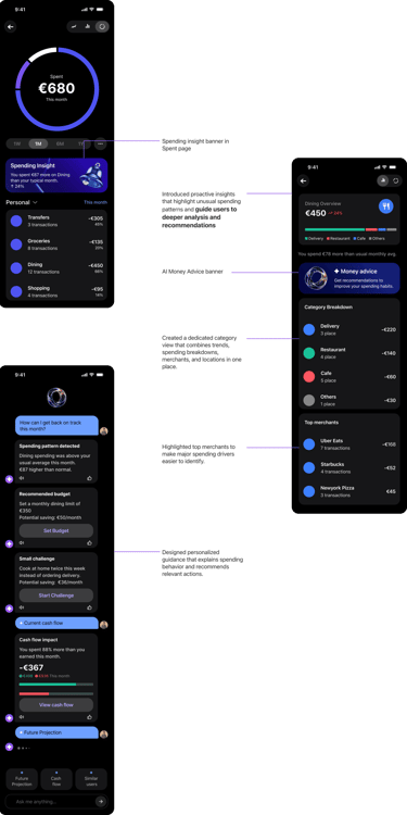
Users often identify spending changes but lack clear next steps. I connected spending insights, category analysis, and AI-powered recommendations into a single flow, helping users move from awareness to understanding and action.
We validated the final concepts through user feedback, using participant insights to refine interactions, improve clarity, and strengthen the overall user experience.
We collected user feedback on the new designs

Iteration
Quick quiz
UI Updates based on the feedback
User feedback revealed that the guessing game created momentary interaction but did not provide meaningful value or encourage deeper engagement. The final design focused on actionable insights and personalized guidance instead of standalone gamification.
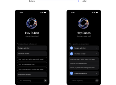
Guided Question Discovery
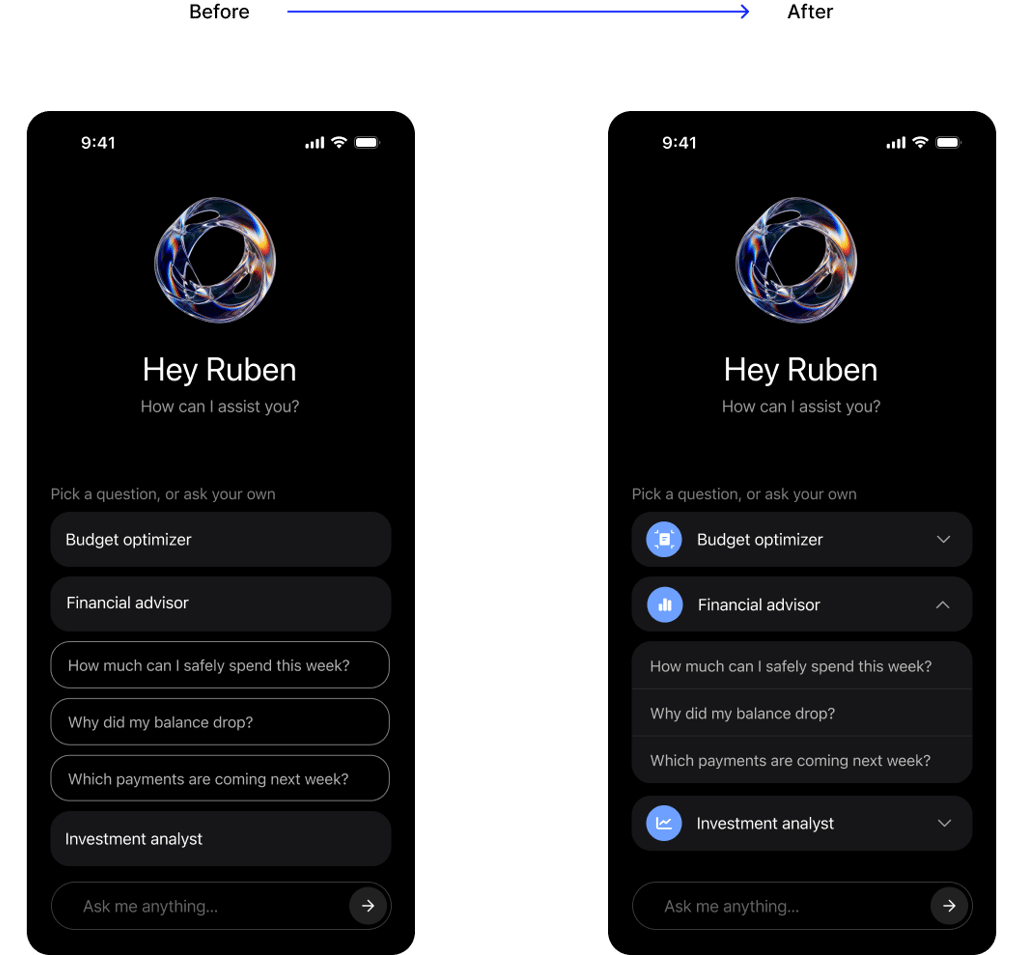
Users overlooked suggested questions because the category structure was unclear. I introduced expandable categories to better communicate the hierarchy and improve question discoverability.
Key Takeaways
This project reinforced that effective financial experiences are not about showing more data, but about helping users make better decisions. By diagnosing behavioral patterns, reducing information overload, and connecting insights directly to relevant actions, the experience moves users from understanding what happened to knowing what to do next, without forcing them through complex or disconnected flows.