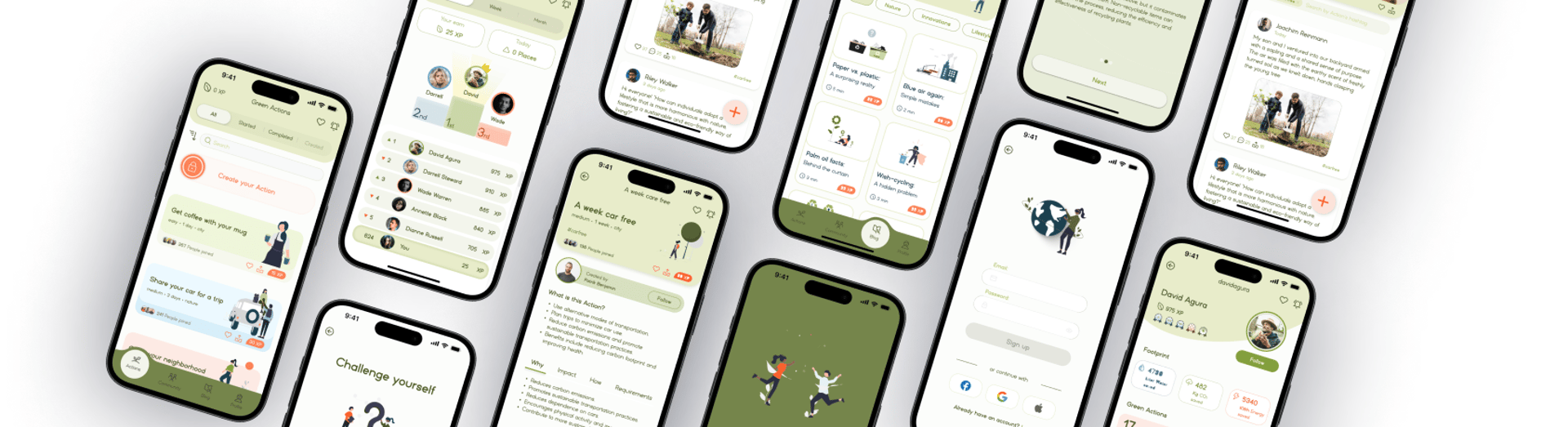
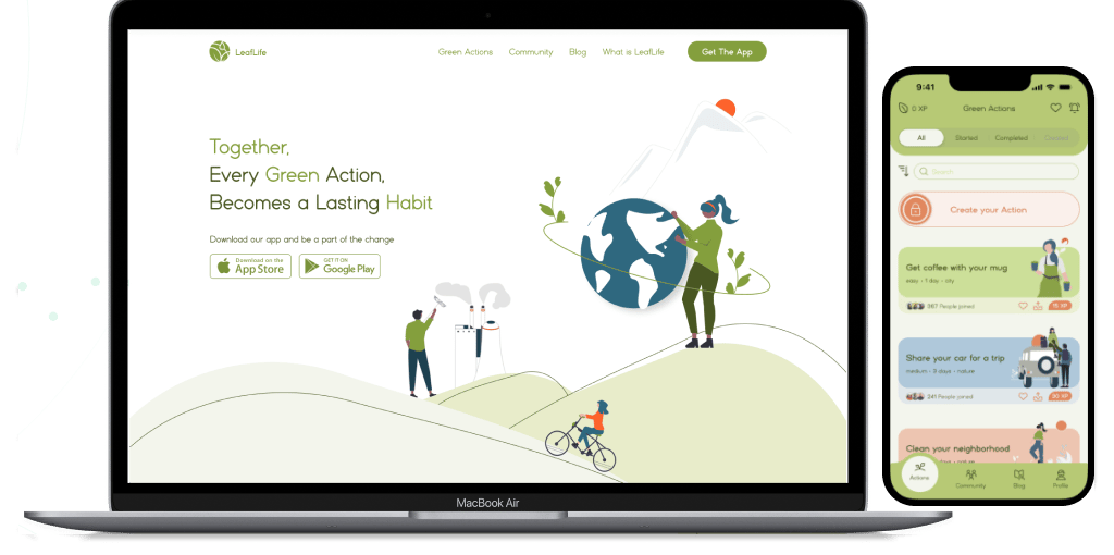
LeafLife App
A community app for joyful habits that boost well-being and help the planet.
My Role
UX Researcher
UX/UI Designer
Project Type:
Bootcamp Case Study
Team
3 Mid-Level Designers
1 Senior UX Designer
Duration
3 Weeks
Project Overview
LeafLife is a community-driven app that promote awareness and personal growth combined with environmental responsibility. This app provides various individual and group challenges to the users or let them craft their own environmental and sustainable activities.
As they grow and contribute, they earn sustainable rewards, fostering a culture of continuous learning and eco-action. In addition, the app allows users to track and visualize the positive impacts they've made on the environment.
Problem Statement
Scarcity of accessible info on sustainable practices
Lack of motivation for eco-friendly habits
Difficulty finding supportive environmental groups
Research
We used both interviews and surveys to understand our users. Surveys helped identify our target audience and their motivations, while interviews gave us deeper insights into their experiences and emotions.
Key Research Insights
Unawareness: Participants lacked knowledge about the direct environmental impact of their water, electricity, and consumption habits.
Guidance Gap: Many participants felt a need for clear guidance on where to start in their journey to reduce environmental impact.
Barrier Challenges: Overcoming obstacles like limited time and knowledge was a common concern, highlighting the importance of seamless solutions integrated into daily routines.
Motivation to Track Personal Progress: Users are motivated to track their personal progress and visualize positive impacts on the environment.
“Knowing how our actions affect the environment encourages responsibility and helps us stop harmful behaviors—an essential role played by education!”
Monic
“The group gives strength and motivation to continue.”
Sara
“Tell me how much percentage I helped the environment with this volume of waste separation!”
Arash

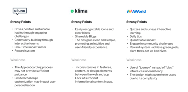
Competitive Analysis
Conducting research on leading enterprises within the sustainable habits platform market is crucial. Analyzing their approaches to similar challenges provides valuable insights into both strengths and weaknesses. This comparative analysis aids in pinpointing potential feature gaps that LeafLife could address. I have examined three direct competitors actively addressing the same issue as our platform.
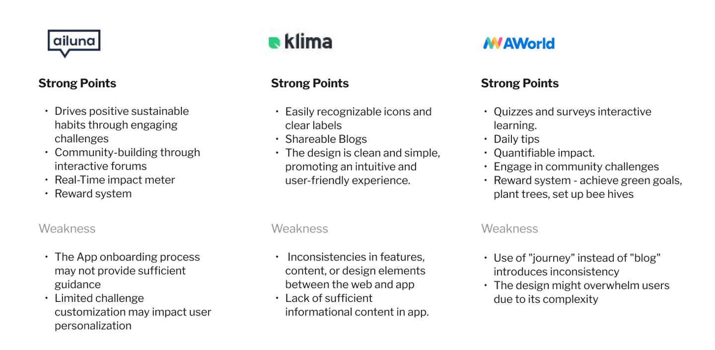
Unite with eco-enthusiasts to make and practice green daily habit.
Our Business Goals:
From these findings, we decided as a product to identify key business goals:
Facilitate users in adopting eco-friendly habits
Encouraging actions that reduce their impact on the planet
Providing opportunities for learning about subjects and topics in this area
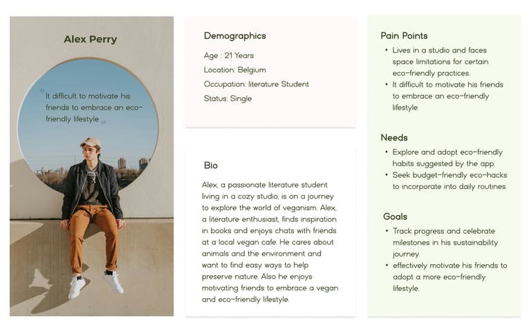
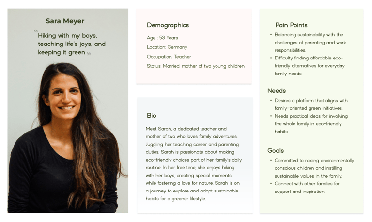
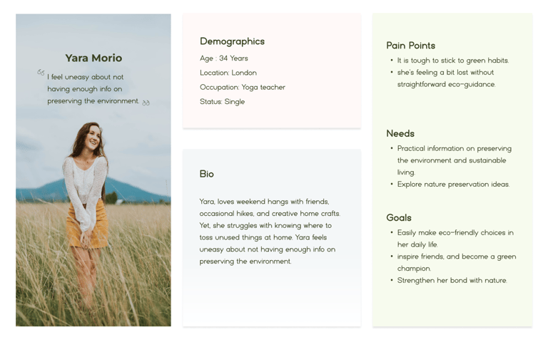
User Empathy
With a clearer understanding of how users perceive our app for eco-friendly actions, we deemed it essential to craft personas representing different age groups derived from survey insights. These personas will play a pivotal role in steering our design decisions as we move forward.

Visualizing a User-Centric Experience
Creating mid-fidelity wireframes revealed the challenge of keeping essential tasks simple and intuitive. This iterative process was key to exploring effective design patterns and understanding user flow across screens, helping shape a more user-centered experience.
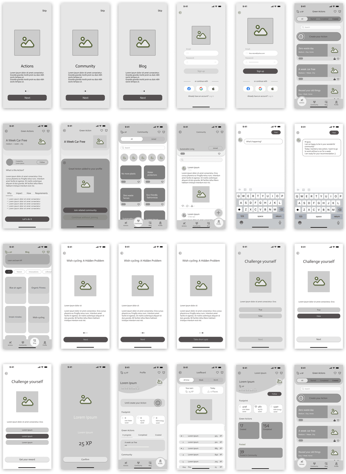
Identifying Points of Confusion through Wireframe Prototypes
After sketching, we created mid-fidelity, clickable wireframes for user testing, observing touch and swipe gestures, and engaging in conversations to understand user expectations. Two key takeaways from this process are:
Users got confused when picking the community for their actions.
Some users suggested adding a preference filter to make choosing actions clearer and smoother.
Refining the Experience Through A/B Testing
Through A/B usability testing, we discovered that users struggled to quickly find relevant eco-actions within the app. Many had to scroll extensively and read through multiple options, which made the experience less intuitive.
Introducing filters significantly improved this. It allowed users to sort actions based on interests, time, or impact—helping them find meaningful activities faster. Additionally, enabling notifications proved valuable in keeping users informed about their progress and reminding them of their ongoing challenges. These features not only streamlined navigation but also strengthened engagement by making users feel more in control of their journey and connected to their environmental footprint.
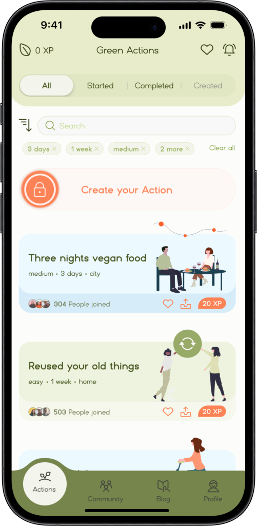
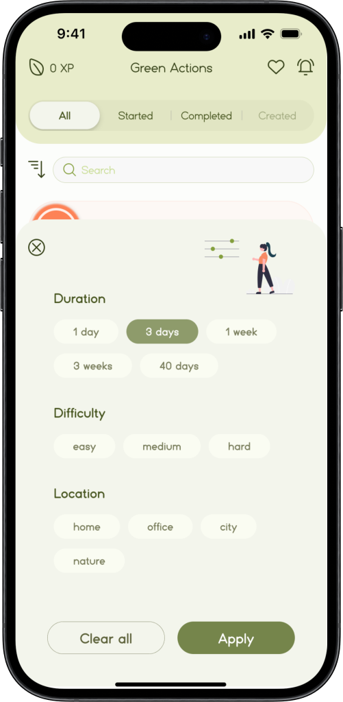
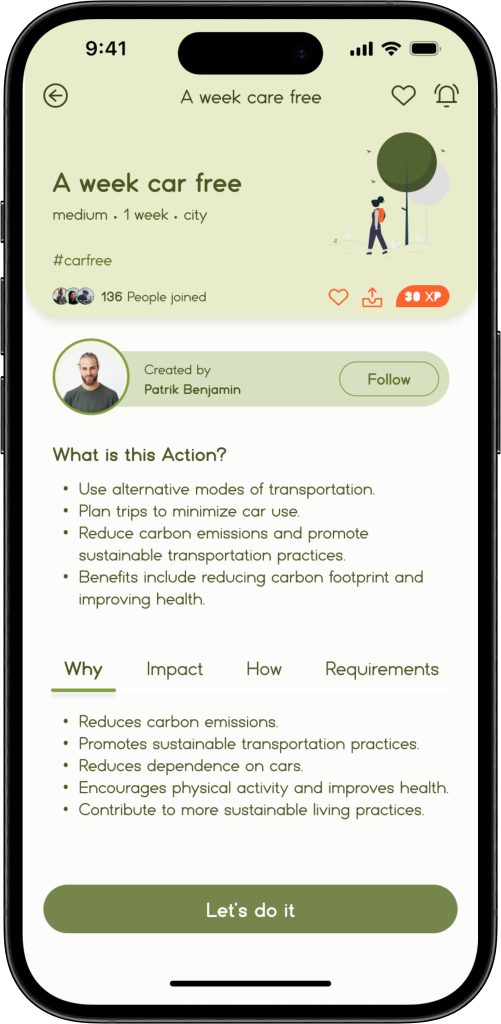
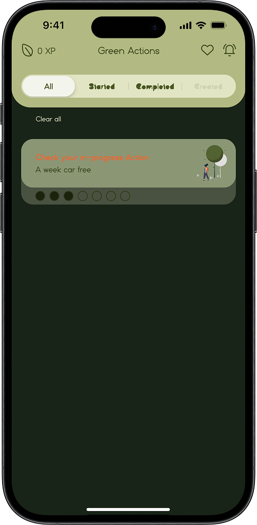
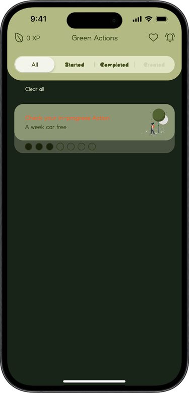
Filter Feature: A Shortcut to Action
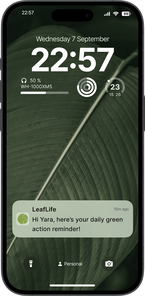
Tracking Impact Through Notifications
Key Takeaways: Lessons Learned
Users value quick access to eco-actions. Too many unstructured choices can lead to decision fatigue and lower engagement.
In sustainability apps, users may need support at different stages. Timely notifications help reinforce commitment and guide users throughout their journey.
Making sustainable choices can feel overwhelming. A simple and friendly interface helps users take action with confidence and ease.
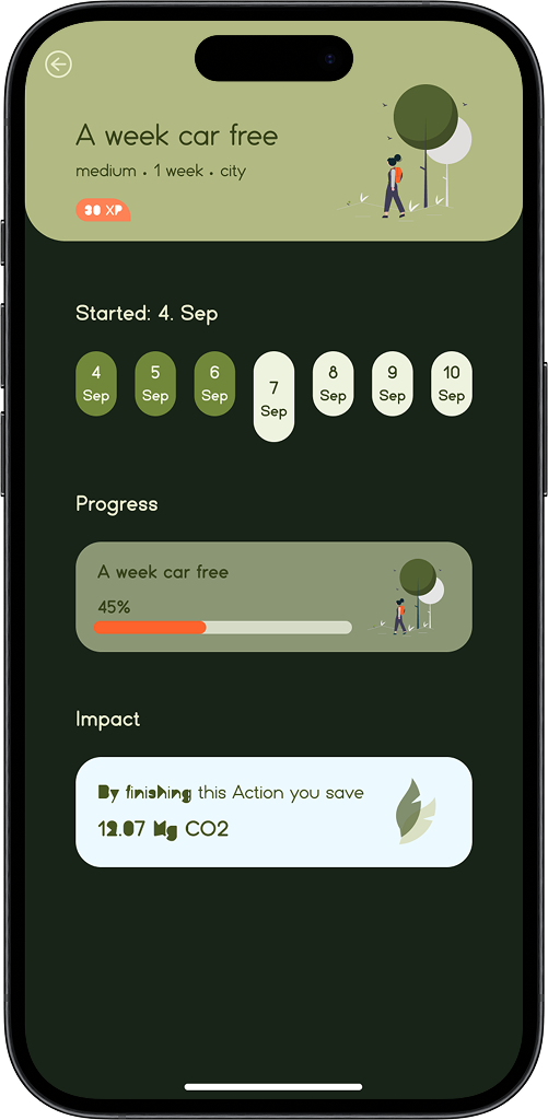
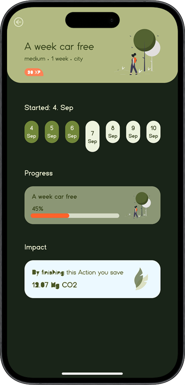
Users appreciate visual progress tracking. Seeing their environmental impact motivates continued use and deepens personal connection to the app’s mission.
Gamification features like rewards, challenges, and streaks boost engagement. When users feel acknowledged and part of a movement, they’re more likely to return.
Trust is essential in building long-term engagement. Consistency, transparency, and encouragement create a supportive experience that promotes user loyalty.